Beginner-Friendly Excel Dashboard Tutorial: Create Professional Dashboards Easily in 2026
Many people think Excel dashboards are only for data analysts or advanced Excel experts.
But the truth is, even beginners can create clean and professional dashboards once they understand the basics.
In fact, dashboards have become one of the most useful Excel skills in modern workplaces. Whether you work in sales, finance, HR, operations, marketing, or even as a freelancer, dashboards help turn messy spreadsheets into simple visual reports that are much easier to understand.
And honestly, this is exactly why Excel dashboards are becoming so popular.
Instead of scrolling through thousands of rows of raw data, a dashboard helps users quickly see:
- Total sales
- Monthly performance
- Top products
- Profit trends
- Employee performance
- Project progress
Everything becomes easier to understand visually.
The good news is that you don’t need advanced coding or complicated formulas to create your first dashboard.
This beginner-friendly tutorial will walk you through the basics of building an Excel dashboard in a simple and practical way.
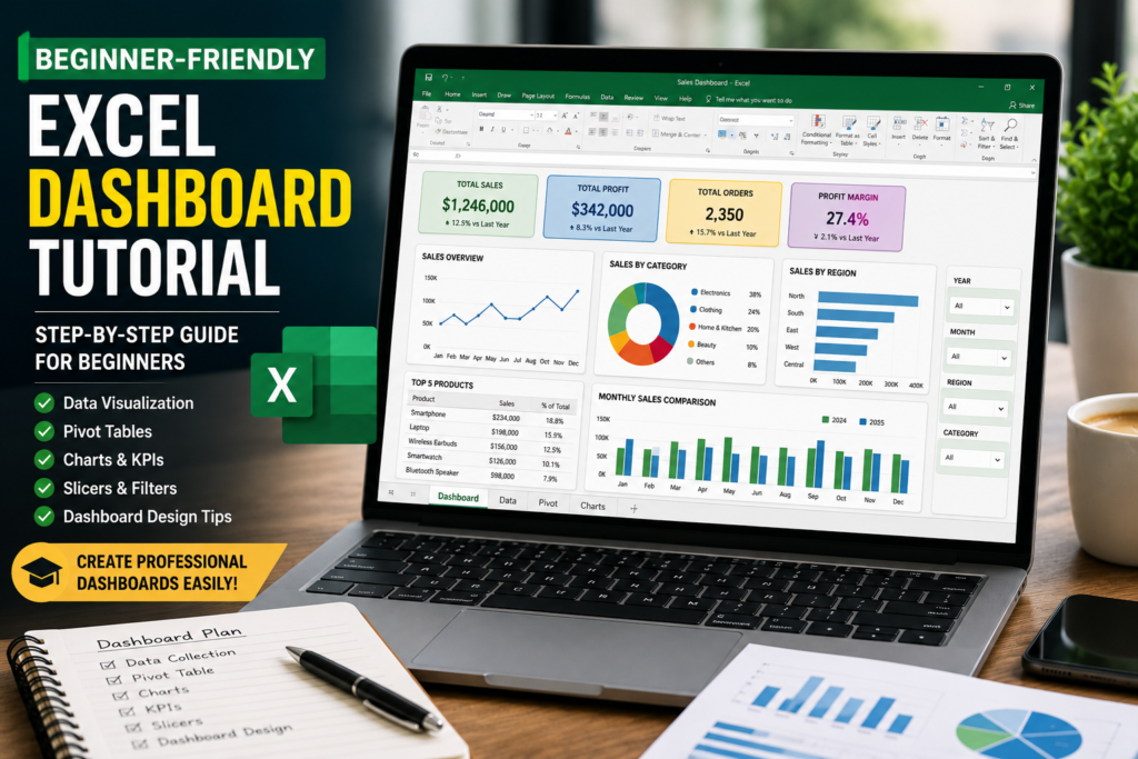
What Is an Excel Dashboard?
An Excel dashboard is a visual summary of important data displayed in one place.
Instead of reading large spreadsheets manually, dashboards use:
- Charts
- Tables
- KPI cards
- Slicers
- Conditional formatting
- Visual indicators
to make information easier to understand.
You can think of a dashboard like a control panel for your data.
For example, a sales dashboard may instantly show:
- Total revenue
- Best-selling products
- Monthly sales growth
- Regional performance
- Target achievement
Instead of spending hours analyzing spreadsheets manually, users can understand business performance in seconds.
Why Excel Dashboards Are So Useful
One reason dashboards are becoming more important is because workplaces now deal with huge amounts of data every day.
And honestly, raw spreadsheets can quickly become overwhelming.
Many office workers spend hours trying to understand reports that could actually be simplified using a clean dashboard.
Dashboards help because they:
- Save time
- Improve decision-making
- Make reports visually attractive
- Reduce confusion
- Help managers understand trends quickly
Even students and freelancers now use dashboards for budgeting, project tracking, and productivity reports.
Step 1: Organize Your Data Properly
This is probably the most important step.
No dashboard works well if the data is messy.
Before creating charts or visuals, make sure your spreadsheet is organized in a clean tabular format.
Your data should ideally include:
- Headers in the first row
- No blank rows
- Consistent formatting
- Proper dates
- Clear categories
For example, a sales dataset might contain:
- Date
- Product Name
- Region
- Sales Amount
- Profit
- Salesperson
Many beginners skip this step and later struggle with charts and formulas.
A clean dataset makes dashboard creation much easier.
Step 2: Convert Data into an Excel Table
Once your data is organized, convert it into an Excel Table.
This small step makes a huge difference.
To do this:
- Select your data
- Press Ctrl + T
- Check “My table has headers”
- Click OK
Excel Tables automatically:
- Expand when new data is added
- Improve formula handling
- Make charts dynamic
- Improve dashboard flexibility
This is one of the easiest ways to make dashboards look more professional.
Step 3: Create Pivot Tables
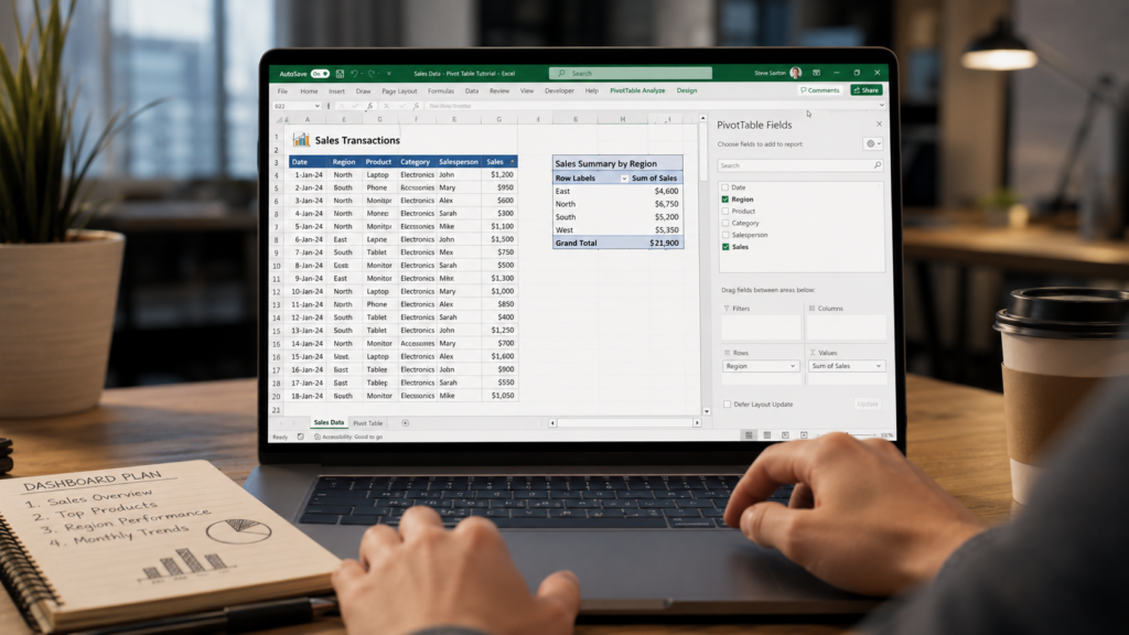
Pivot Tables are the backbone of most Excel dashboards.
They help summarize large amounts of data very quickly.
For beginners, Pivot Tables may look intimidating at first, but they are actually much easier than people expect.
To create one:
- Select your table
- Go to Insert → Pivot Table
- Choose New Worksheet
- Click OK
You can now drag fields into:
- Rows
- Columns
- Values
- Filters
For example:
- Sales in Values
- Region in Rows
- Month in Columns
Instantly, Excel creates a summarized report.
This is where dashboards truly begin to take shape.
Step 4: Add Charts to Visualize Data
Charts make dashboards easier to understand.
And honestly, this is where dashboards start feeling exciting.
Instead of looking at raw numbers, users can instantly identify trends visually.
Some beginner-friendly charts include:
- Column charts
- Bar charts
- Pie charts
- Line charts
- Donut charts
For example:
- Line charts work well for monthly trends
- Pie charts show category distribution
- Bar charts compare performance
One mistake many beginners make is adding too many colorful charts.
Simple dashboards usually perform better because they are easier to read.
Step 5: Add KPI Cards
KPI cards help highlight important numbers quickly.
These are usually small boxes showing:
- Total Sales
- Total Profit
- Orders Count
- Growth Percentage
- Target Achievement
Most professional dashboards use KPI cards because they immediately grab attention.
Even simple formatting with bold fonts and clean colors can make dashboards look modern.
Step 6: Use Slicers for Interactivity
This is one of the most satisfying parts of dashboard creation.
Slicers allow users to filter dashboard data interactively.
For example, users can click:
- Region
- Month
- Product
- Salesperson
and the entire dashboard updates automatically.
To add slicers:
- Select your Pivot Table
- Go to PivotTable Analyze
- Click Insert Slicer
- Select fields
- Click OK
This instantly makes your dashboard feel much more advanced.
Step 7: Design the Dashboard Layout
Dashboard design matters more than many people realize.
Even good data can look confusing if the layout feels cluttered.
A clean dashboard usually includes:
- Title at the top
- KPI cards first
- Charts in organized sections
- Filters on the side
- Consistent colors
Try not to overcrowd the dashboard.
Whitespace actually improves readability.
Many modern dashboards use simple professional colors like:
- Blue
- Dark gray
- Green
- White backgrounds
Common Mistakes Beginners Make
Using Too Many Charts
More charts do not always make dashboards better.
Too many visuals can overwhelm users.
Ignoring Data Cleaning
Messy data creates broken charts and incorrect reports.
Clean data is essential.
Using Bright Random Colors
Professional dashboards usually use limited color palettes.
Too many bright colors make reports harder to read.
Overcomplicating Formulas
Beginners often try advanced formulas too early.
Simple dashboards usually work best.
Why Learning Dashboards Is a Valuable Skill
Excel dashboard skills are highly valuable in modern workplaces.
Companies increasingly want employees who can:
- Analyze data
- Create reports
- Visualize trends
- Present information clearly
Even basic dashboard knowledge can improve productivity significantly.
For freelancers and job seekers, dashboard skills also look impressive on resumes and portfolios.
Final Thoughts
Creating your first Excel dashboard may feel difficult initially, but once you understand the basics, the process becomes surprisingly enjoyable.
The important thing is to start simple.
You do not need advanced VBA, Power Query, or complicated formulas to build a useful dashboard.
In reality, some of the best dashboards are clean, simple, and easy to understand.
Focus on:
- Clean data
- Simple charts
- Clear KPIs
- Organized layout
- User-friendly design
Over time, your dashboards will naturally become more professional and interactive.
And honestly, once you build your first dashboard successfully, you’ll probably start using dashboards for everything — from work reports to personal budgeting and productivity tracking.