
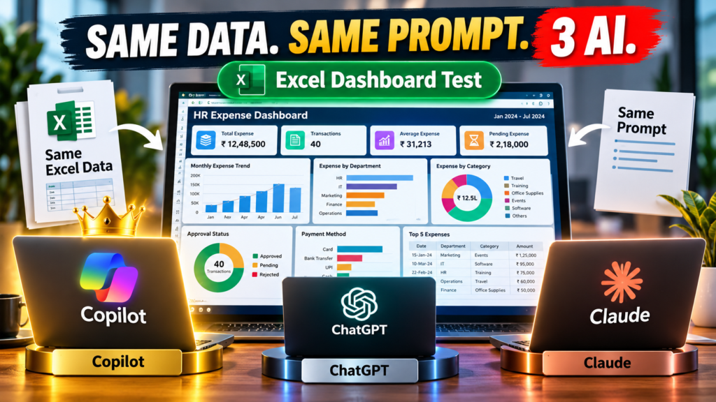

Excel Dashboard Challenge:- Same Excel data. Same prompt. Same dashboard requirements. Three AI tools. One real-world test.
Can Microsoft Copilot, ChatGPT, or Claude build the best Excel dashboard when all three are given exactly the same data and exactly the same instructions?
I wanted to find out.
Instead of relying on AI benchmarks, marketing claims, or generic comparisons, I created a real Excel dashboard challenge using an HR expense dataset.
Then I gave the same raw data and the same detailed prompt to:
- Microsoft Copilot
- ChatGPT
- Claude
The result was surprisingly interesting.
In my test, Copilot produced the result I preferred.
But don’t just take my word for it.
I’ve included the same raw Excel data and the exact prompt below so you can run the experiment yourself.
The Experiment: Same Data, Same Prompt, Same Task
AI comparisons are often difficult to judge because different tools are given different instructions.
That’s not what I wanted.
I wanted a simple, repeatable test.
So I created one Excel dashboard challenge and kept the important variables identical.
Every AI received:
The same Excel dataset
The same prompt
The same dashboard requirements
The same business objective
The dataset contains approximately 40 HR expense transactions covering January through July 2024.
The data includes:
- Date
- Department
- Category
- Amount (INR)
- Payment Method
- Approval Status
The original instructions specifically required the AI to use the existing transaction data and not create fake or sample data.
The prompt also required the AI to inspect the workbook before building the dashboard and preserve the original transaction records.
What Was the AI Asked to Build?
This wasn’t a simple:
“Create an Excel dashboard.”
The prompt described a complete premium HR Expense Dashboard designed for HR managers, finance managers and business executives.
The dashboard needed to provide visibility into:
- Total spending
- Number of transactions
- Average expense
- Pending expenses
- Monthly spending trends
- Department spending
- Expense categories
- Approval status
- Payment methods
- High-value transactions
- Management insights
The dashboard was also expected to look more like a modern executive analytics product than a traditional Excel report.
The Excel Dashboard Challenge
Here are the major requirements given to all three AI tools.
1. Total Expense
Calculate total spending from the actual transaction data.
2. Number of Transactions
Count the actual expense transactions.
3. Average Expense
Calculate the average expense using the actual data.
4. Pending Expense
Calculate the total amount currently marked as pending.
5. Monthly Expense Trend
Create a monthly expense trend using the actual Date field.
The dashboard needed to cover:
January → February → March → April → May → June → July
There was also an important instruction:
July may contain partial-month data.
The AI was specifically told not to incorrectly interpret July as a complete month.
6. Department Analysis
Create a department-level expense analysis showing:
Department → Total Expense
The departments needed to be calculated from the actual dataset rather than manually entered.
7. Expense Category Analysis
Analyze total spending by category.
Again, the AI was instructed to use the actual categories in the dataset rather than manually entering example categories.
8. Approval Status
Analyze spending by:
- Approved
- Pending
- Rejected
The prompt specifically requested analysis based on expense amounts, rather than simply counting transactions.
9. Payment Method
Analyze spending by the actual payment methods contained in the workbook.
10. Top 5 Expenses
The dashboard needed to identify the five largest transactions.
The requested columns were:
- Date
- Department
- Category
- Amount
- Approval Status
11. Management Insights
This was one of the more interesting requirements.
The AI wasn’t supposed to produce generic statements such as:
“Marketing has expenses.”
Instead, it was asked to analyze the actual data and generate useful management observations, including things such as:
- Highest-spending department
- Lowest-spending department
- Highest-spending category
- Highest-spending month
- Pending expense amount
- Percentage of expense pending
- Largest individual transaction
- Most-used payment method
- Department with the highest pending expense
In other words, the AI had to do more than make the dashboard look good.
It had to understand the data.
The Dashboard Also Had to Be Dynamic
Another important part of the test was that the dashboard shouldn’t simply contain hard-coded numbers.
The prompt asked the AI to use appropriate Excel functionality such as:
- Excel Tables
- PivotTables
- PivotCharts
- SUMIFS
- COUNTIFS
- Dynamic formulas
The goal was for the dashboard to update when new transactions were added.
For example, adding a new transaction should potentially update:
- Total Expense
- Transaction Count
- Average Expense
- Pending Expense
- Monthly Trend
- Department Analysis
- Category Analysis
- Payment Method Analysis
- Approval Analysis
This makes the challenge much closer to a real-world Excel automation project.
And Then I Ran the Same Test Three Times
Once the dataset and prompt were ready, I gave them to the three AI tools.
Test #1 — Microsoft Copilot
Same data.
Same prompt.
Same requirements.
Test #2 — ChatGPT
Same data.
Same prompt.
Same requirements.
Test #3 — Claude
Same data.
Same prompt.
Same requirements.
No changing the requirements between tests.
No giving one AI additional instructions.
No manually redesigning one dashboard to make it look better.
The objective was to see what each AI could produce from the same starting point.
The Results
And this is where the experiment became interesting.
After comparing the outputs, Copilot was the result I preferred for this particular Excel dashboard challenge.
That doesn’t mean Copilot is automatically the best AI for every task.
It doesn’t mean ChatGPT or Claude cannot create excellent Excel dashboards.
And it certainly doesn’t mean that one experiment can establish a universal ranking of AI tools.
It means something much more specific:
For this particular dataset, prompt and Excel dashboard challenge, Copilot produced the result I preferred.
That’s the result of my test.
Why I Wanted to Make the Test Reproducible
I could simply show readers my conclusion.
But that wouldn’t be nearly as interesting.
So I decided to make the experiment reproducible.
You can download the exact files I used.
Raw Excel dataset:
Download the Excel data 👇
Exact prompt:
Download the prompt 👇
Complete test pack:
Download the complete test pack👇
You can use the files to run the same challenge yourself.
Try the AI Excel Dashboard Challenge Yourself
Here’s the experiment I’d recommend.
Step 1 — Download the raw Excel file
Use the exact dataset from this experiment.
Do not modify the data before testing.
Step 2 — Download the exact prompt
Use the prompt exactly as provided.
Don’t shorten it.
Don’t add extra instructions.
Don’t change the requirements.
Step 3 — Choose an AI tool
Run the test with:
Microsoft Copilot
Then repeat the same test with:
ChatGPT
And finally:
Claude
Step 4 — Compare the resulting Excel workbooks
Don’t judge only the screenshots.
Open the actual files.
Look at:
- Calculations
- Formulas
- Charts
- Data accuracy
- Dashboard layout
- Interactivity
- Dynamic behavior
- Insights
- Formatting
Step 5 — Add a new transaction
This is an especially useful test.
Add another expense record to the source data.
Then check:
Does the dashboard update correctly?
That’s where the difference between a visually impressive dashboard and a genuinely useful Excel solution can become apparent.
What Should You Look For?
If you run this experiment yourself, don’t simply ask:
“Which dashboard looks better?”
Instead, evaluate the output from several perspectives.
| Area | What to Check |
|---|---|
| Data accuracy | Are calculations correct? |
| Formulas | Are numbers dynamically calculated? |
| Charts | Do charts represent the correct data? |
| Design | Is the dashboard easy to understand? |
| Interactivity | Do filters and slicers work? |
| Scalability | Does it handle additional transactions? |
| Insights | Are observations based on actual data? |
| Excel compatibility | Does everything work properly inside Excel? |
| Usability | Could someone actually use it for business reporting? |
This is a much better way to evaluate an AI-generated Excel solution.
One Important Lesson: The Prompt Matters
Perhaps the biggest lesson from this experiment isn’t which AI produced the preferred dashboard.
It’s the importance of the prompt.
Compare these two instructions:
Simple prompt
Create an HR expense dashboard in Excel.
That’s it.
The AI has to make many decisions on its own.
Now compare that with a detailed specification covering:
- Data structure
- KPIs
- Charts
- Filters
- Currency formatting
- Data validation
- Dynamic calculations
- Dashboard layout
- Management insights
- Data quality
- Partial-month interpretation
- Excel Tables
- Supporting analysis
- Quality checks
The second prompt leaves far less room for ambiguity.
That can dramatically change the quality of an AI-generated result.
AI Can Build the Dashboard — But You Still Need to Check It
This experiment also reinforced an important rule:
Never assume an AI-generated Excel workbook is automatically correct.
Even if the dashboard looks impressive.
A professional workbook should be checked for:
- Incorrect formulas
- Incorrect totals
- Missing records
- Wrong chart sources
- Hard-coded values
- Broken references
- Incorrect date handling
- Incorrect interpretation of partial periods
- Non-dynamic calculations
- Formatting problems
The original test prompt included a detailed final quality check specifically for this reason.
The July Problem Is a Good Example
Consider the July data in this experiment.
If July contains only part of the month, comparing July directly with complete months could lead to a misleading conclusion.
For example, saying:
“July had the lowest monthly spending.”
could be technically true in the dataset while still being a poor business interpretation.
The correct context is:
July is a partial-month period in the supplied dataset.
This is a small example, but it demonstrates why data interpretation matters just as much as dashboard design.
So, Which AI Won?
For this particular experiment:
🏆 Copilot
Copilot was the AI result I preferred after comparing the three outputs for this Excel dashboard challenge.
But here’s the important qualification:
This is not a universal AI leaderboard.
It’s a controlled test of one specific task.
The result could potentially change if we changed:
- The dataset
- The prompt
- The Excel task
- The complexity
- The required output
- The evaluation criteria
- The AI model version
That’s exactly why reproducible AI experiments are useful.
Don’t Take My Word for It — Run the Test
This is the part I’m most interested in.
I’ve provided the same raw data and exact prompt so you can perform your own experiment.
Download everything here:
Then run the same prompt through:
Copilot → ChatGPT → Claude
And compare the actual Excel files.
Your Turn: Which AI Would You Choose?
After running the experiment, I’d love to know what you think.
Which dashboard would you choose?
Would your decision be based on:
- Design
- Accuracy
- Formulas
- Charts
- Interactivity
- Automation
- Business insights
- Ease of editing
Or something else?
Tell me your result in the comments.
It would be fascinating to see whether other users get the same result.
Final Takeaway
The most interesting part of AI isn’t simply asking:
“Which AI is the best?”
A better question is:
“Which AI performs best for the job I actually need to do?”
In this experiment, the job was very specific:
Build a professional, dynamic HR Expense Dashboard in Excel using real transaction data.
I gave Copilot, ChatGPT and Claude the same data and the same prompt.
And in my test:
Copilot produced the result I preferred.
But now you can run the same experiment yourself.
Same data.
Same prompt.
Same challenge.
Let’s see what you get.

