
Excel Sales Dashboard:-Most Excel users spend hours looking at rows and columns of data but still struggle to find meaningful insights. What if you could transform the same raw data into a professional dashboard that instantly reveals sales trends, profit performance, top-performing regions, and category-wise analysis?
In this tutorial, I’ll show you exactly how I converted a simple sales dataset into a fully interactive Excel Sales Dashboard using Pivot Tables, Charts, KPI Cards, and Slicers.
What You Will Learn in This Excel Dashboard Tutorial
- Create an Excel Dashboard from scratch
- Build Pivot Tables for analysis
- Create KPI Cards
- Add dynamic charts
- Insert slicers for filtering
- Design a professional dashboard layout
Step 1: Prepare Your Raw Data
The foundation of every successful dashboard is clean and structured data. My dataset contains Date, Region, Category, Units, Unit Price, Sales, Cost, and Profit columns.
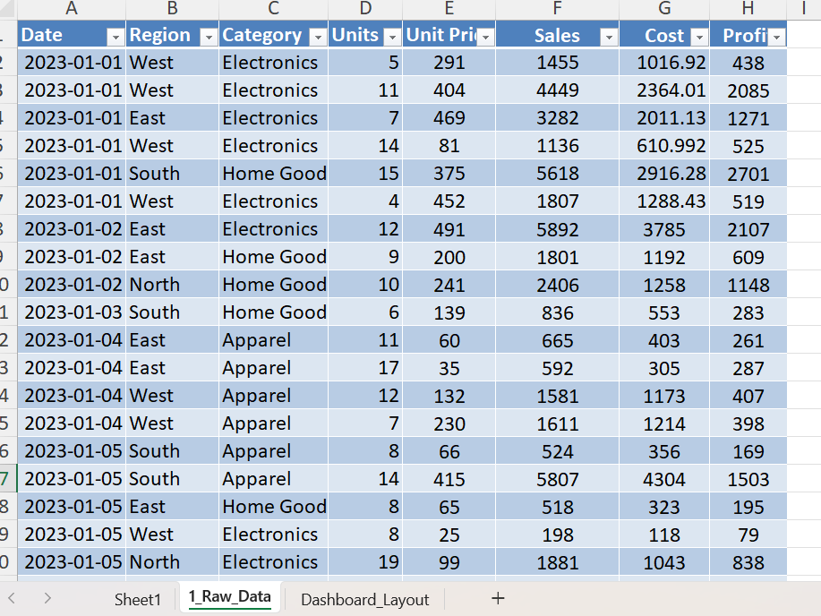
Convert the Data into an Excel Table
Select the complete dataset and press Ctrl + T. Excel Tables automatically expand when new records are added and work perfectly with Pivot Tables.
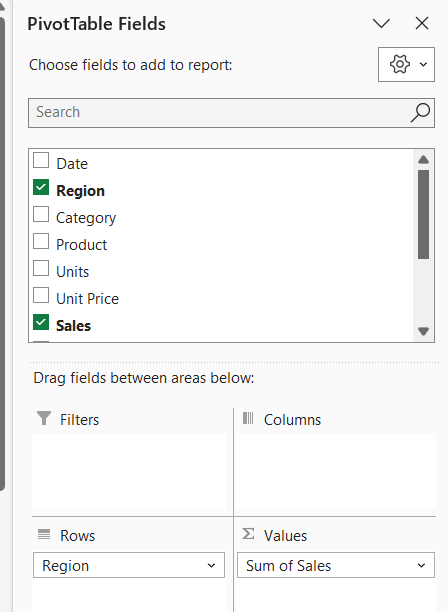
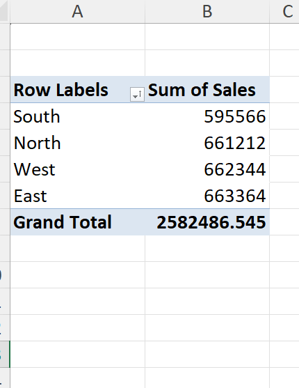
Step 2: Create Pivot Tables
Pivot Tables are the engine behind the dashboard. They summarize thousands of rows into meaningful business insights.
Sales by Region Pivot Table
- Region → Rows
- Sales → Values
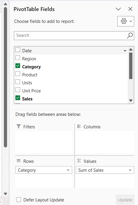
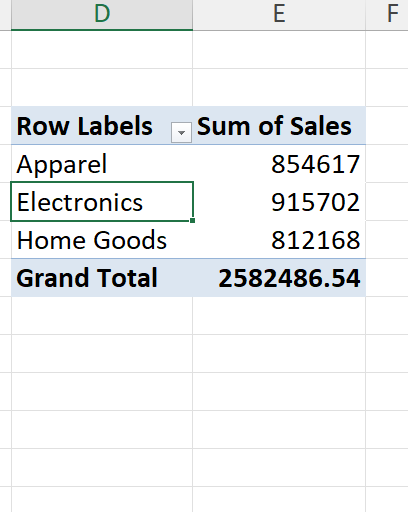
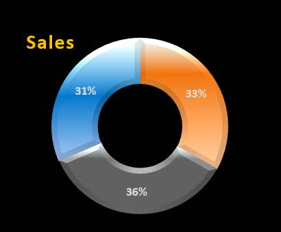
Sales by Category Pivot Table
- Category → Rows
- Sales → Values
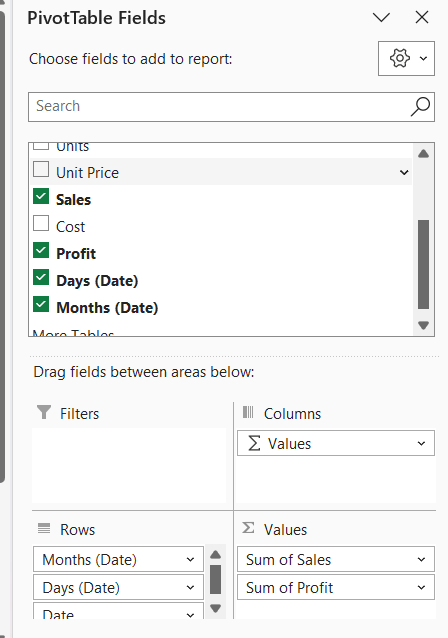
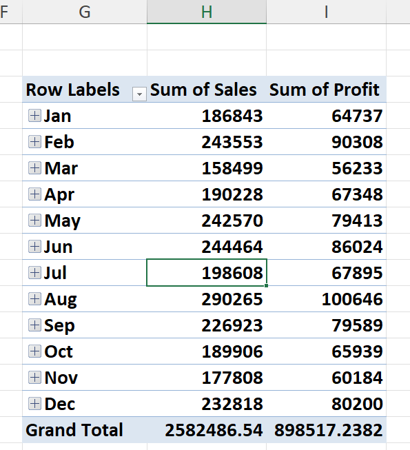
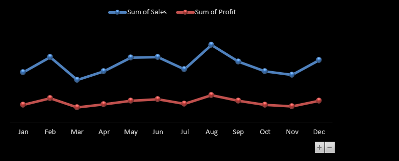
Monthly Sales and Profit Pivot Table
- Date → Rows
- Sales → Values
- Profit → Values
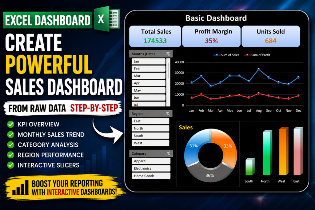
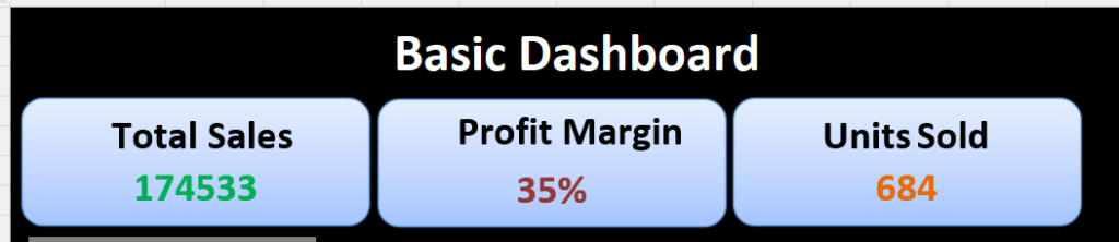
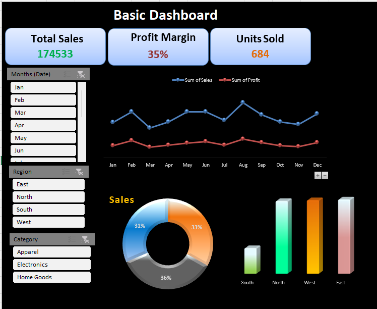
Step 3: Create KPI Cards
KPI Cards provide a quick overview of business performance.
Total Sales KPI
Displays overall revenue generated.
Profit Margin KPI
Shows profitability percentage.
Units Sold KPI
Displays total quantity sold.
Step 4: Create the Dashboard Layout
Create a new worksheet called Dashboard Layout. This worksheet will contain all charts, KPIs, and filters.
Step 5: Add Interactive Slicers
Slicers allow users to filter the dashboard instantly.
- Month Slicer
- Region Slicer
- Category Slicer
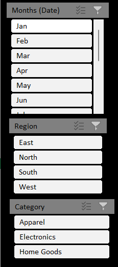
Step 6: Connect Slicers to All Pivot Tables
Right-click the slicer and select Report Connections. Connect every Pivot Table to create a fully interactive dashboard.
Step 7: Create Monthly Sales Trend Chart
Insert a Line Chart using Monthly Sales and Monthly Profit data. This chart highlights seasonal trends and business growth.
Step 8: Create a Category Distribution Chart
Use a Doughnut Chart to display category-wise sales contribution.
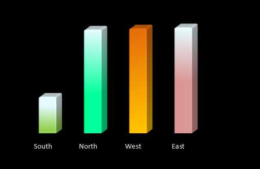
Step 9: Create a Regional Performance Chart
Use a Column Chart to compare sales performance across East, West, North, and South regions.
Step 10: Apply Professional Formatting
A professional dashboard should be visually appealing and easy to read.
- Dark theme background
- Consistent color palette
- Rounded KPI cards
- Professional fonts
- Aligned charts and visuals
Final Result
After combining Pivot Tables, KPI Cards, Charts, and Slicers, the result is a fully interactive Excel Sales Dashboard capable of providing real-time business insights.
Download This Excel Dashboard Template
Want this dashboard template? Comment DASHBOARD below and I’ll share the complete Excel file with:
- Raw Data
- Pivot Tables
- KPI Cards
- Interactive Slicers
- Dashboard Layout
Frequently Asked Questions
Can beginners create this dashboard?
Yes, this tutorial is beginner-friendly.
Do I need VBA?
No, the entire dashboard is built without VBA.
Which Excel version supports this dashboard?
Excel 2016, Excel 2019, Excel 2021, and Microsoft 365.


DASHBOARD
Please download from this link:- https://us.seoanalyser.in/wp-content/uploads/2026/06/Sales_Dashboard_Tutorial.xlsx
I like your programs. They are professionally build.
Please download from this link:- https://us.seoanalyser.in/wp-content/uploads/2026/06/Sales_Dashboard_Tutorial.xlsx
Dashboard
Please download from this link:- https://us.seoanalyser.in/wp-content/uploads/2026/06/Sales_Dashboard_Tutorial.xlsx
Thank you for the explanation. Please send it DASHBOARD.
Sincerely, thank you.
Please download from this link:- https://us.seoanalyser.in/wp-content/uploads/2026/06/Sales_Dashboard_Tutorial.xlsx
Pingback: I Built a Complete Excel Dashboard in 60 Seconds! Using VBA — Here's How It Changed My Workflow - Excel AI Tools and SEO Guides
DASHBOARD
https://us.seoanalyser.in/wp-content/uploads/2026/06/Sales_Dashboard_Tutorial.xlsx
Pingback: How to Create a Dynamic Excel Project Tracker Dashboard with Claude AI (Step-by-Step Guide-2026) - Excel AI Tools and SEO Guides