
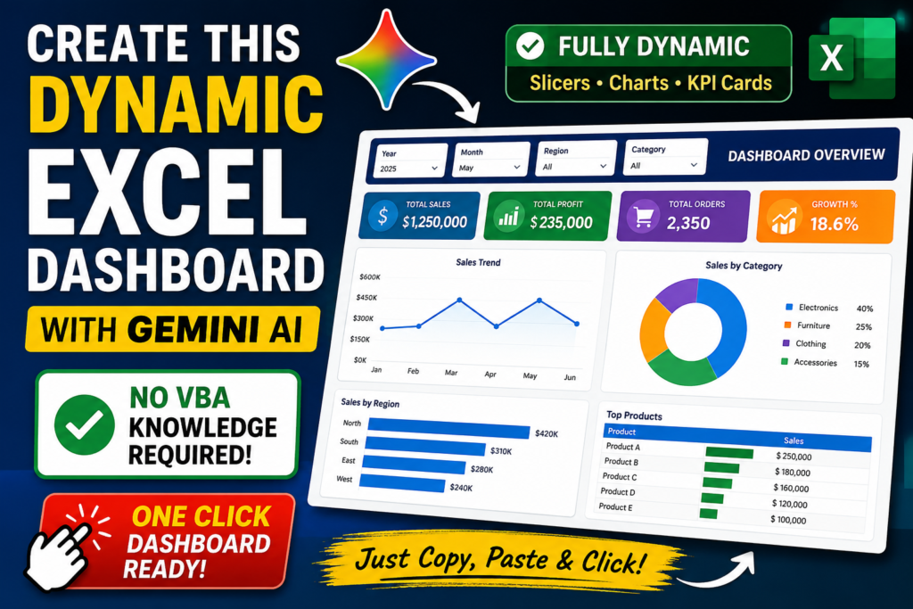

Dashboard Using Gemini AI : Can AI really build a professional Excel dashboard?
After spending hours experimenting with different prompts, testing multiple approaches, and fixing errors, I finally created a fully dynamic Excel Dashboard with the help of Gemini AI.
The best part?
You don’t need to be an Excel VBA expert to create it.
In this article, I’ll show you how this dashboard works, how it was generated, and how you can build the same dashboard in just a few minutes.
What Makes This Dashboard Special?
This isn’t a static Excel report.
It’s a fully interactive dashboard where every component responds instantly to user selections.
Key Features
- Fully dynamic slicers
- Interactive charts
- Dynamic KPI cards
- Automatic filtering
- Professional dashboard layout
- One-click dashboard generation
- Beginner-friendly setup
- No manual VBA programming required
Whether you’re creating dashboards for your company, clients, or personal projects, this approach can save hours of development time.
Built with Gemini AI
One of the biggest advantages of AI is that it can generate complex VBA code much faster than writing everything manually.
However, creating the perfect dashboard wasn’t as simple as asking Gemini once.
It required multiple prompt iterations, testing different outputs, correcting errors, and refining the generated VBA code until everything worked perfectly.
After several rounds of trial and error, I finally achieved a clean, working solution.
Dynamic Slicers That Control Everything
The dashboard uses interactive slicers to control the entire report.
Whenever you select a different value from a slicer:
- Charts update instantly
- KPI cards refresh automatically
- Data filters change in real time
- Visual insights remain synchronized
This creates a smooth user experience without requiring any manual filtering.
No VBA Coding Experience Required
Many Excel users avoid VBA because they think programming is difficult.
This dashboard proves otherwise.
Once the VBA code has been generated, the setup process is surprisingly simple.
You only need to copy the code, paste it into Excel, assign it to a button, and run the macro.
The dashboard is created automatically.
Step 1: Open the VBA Editor
Open your Excel workbook.
Navigate to the Developer tab.
Click Visual Basic to launch the VBA Editor.
If you don’t see the Developer tab, you can enable it from Excel Options.
Step 2: Insert a New Module
Inside the VBA Editor:
- Click Insert
- Select Module
A blank module will appear.
This is where the generated VBA code will be placed.
Step 3: Paste the Generated Code
Copy the VBA code generated by Gemini AI.
Paste it into the newly created module.
Sub CreateUltimateDarkDashboard()
    Dim wsData As Worksheet, wsDash As Worksheet, wsPivot As Worksheet
    Dim pc As PivotCache
    Dim ptRegion As PivotTable, ptCategory As PivotTable, ptRep As PivotTable, ptKPI As PivotTable
    Dim chartRegion As ChartObject, chartCategory As ChartObject, chartRep As ChartObject
    Dim lastRow As Long, lastCol As Long
    Dim dataRange As Range

    ' ---------------------------------------------------------
    ' 1. SETUP & CLEANUP
    ' ---------------------------------------------------------
    Set wsData = ActiveSheet
    If WorksheetFunction.CountA(wsData.Cells) = 0 Then
        MsgBox "Please select your Sales Data sheet and try again.", vbCritical
        Exit Sub
    End If

    lastRow = wsData.Cells(wsData.Rows.Count, 1).End(xlUp).Row
    lastCol = wsData.Cells(1, wsData.Columns.Count).End(xlToLeft).Column
    Set dataRange = wsData.Range(wsData.Cells(1, 1), wsData.Cells(lastRow, lastCol))

    Application.DisplayAlerts = False
    On Error Resume Next
    ThisWorkbook.Worksheets("Dashboard").Delete
    ThisWorkbook.Worksheets("PivotData").Delete
    On Error GoTo 0
    Application.DisplayAlerts = True

    ' ---------------------------------------------------------
    ' 2. CREATE SHEETS & APPLY BACKGROUND
    ' ---------------------------------------------------------
    Set wsDash = ThisWorkbook.Worksheets.Add(After:=wsData)
    wsDash.Name = "Dashboard"
    Set wsPivot = ThisWorkbook.Worksheets.Add(After:=wsDash)
    wsPivot.Name = "PivotData"
    wsPivot.Visible = xlSheetHidden

    wsDash.Activate
    ActiveWindow.DisplayGridlines = False
    wsDash.Cells.Interior.Color = RGB(15, 23, 42) ' Deep Navy Background

    ' Title
    With wsDash.Range("B2")
        .Value = "EXECUTIVE SALES PERFORMANCE"
        .Font.Size = 20
        .Font.Bold = True
        .Font.Color = RGB(241, 245, 249)
        .Font.Name = "Segoe UI"
    End With

    Set pc = ThisWorkbook.PivotCaches.Create(SourceType:=xlDatabase, SourceData:=dataRange)

    ' ---------------------------------------------------------
    ' 3. CREATE KPI PIVOT TABLE & CARDS
    ' ---------------------------------------------------------
    Set ptKPI = pc.CreatePivotTable(TableDestination:=wsPivot.Range("A20"), TableName:="PT_KPI")
    With ptKPI
        .AddDataField .PivotFields("Revenue"), "Total Revenue", xlSum
        .AddDataField .PivotFields("Profit"), "Total Profit", xlSum
        .AddDataField .PivotFields("Quantity"), "Units Sold", xlSum
        .AddDataField .PivotFields("Profit Margin %"), "Avg Margin", xlAverage
    End With

    ' Build 4 KPI Cards (Title, Field Name, Cell to Store Data, Left Position, Top Position, Format)
    BuildKPICard wsDash, wsPivot, "TOTAL REVENUE", "Total Revenue", "G20", 20, 60, "[$$-409]#,##0"
    BuildKPICard wsDash, wsPivot, "TOTAL PROFIT", "Total Profit", "G21", 195, 60, "[$$-409]#,##0"
    BuildKPICard wsDash, wsPivot, "UNITS SOLD", "Units Sold", "G22", 370, 60, "#,##0"
    BuildKPICard wsDash, wsPivot, "AVG MARGIN", "Avg Margin", "G23", 545, 60, "0.0%"

    ' ---------------------------------------------------------
    ' 4. CREATE CHARTS
    ' ---------------------------------------------------------
    ' Chart 1: Revenue by Region (Column)
    Set ptRegion = pc.CreatePivotTable(TableDestination:=wsPivot.Range("A3"), TableName:="PT_Region")
    With ptRegion
        .PivotFields("Region").Orientation = xlRowField
        .AddDataField .PivotFields("Revenue"), "Total Revenue", xlSum
    End With
    Set chartRegion = wsDash.ChartObjects.Add(Left:=20, Top:=160, Width:=335, Height:=230)
    With chartRegion.Chart
        .SetSourceData Source:=ptRegion.TableRange1
        .ChartType = xlColumnClustered
        .HasTitle = True
        .ChartTitle.Text = "Revenue by Region"
        .SeriesCollection(1).Format.Fill.ForeColor.RGB = RGB(41, 128, 185)
        .HasLegend = False
    End With
    ApplyDarkTheme chartRegion.Chart

    ' Chart 2: Category Performance (Doughnut)
    Set ptCategory = pc.CreatePivotTable(TableDestination:=wsPivot.Range("E3"), TableName:="PT_Category")
    With ptCategory
        .PivotFields("Category").Orientation = xlRowField
        .AddDataField .PivotFields("Revenue"), "Total Revenue ", xlSum
    End With
    Set chartCategory = wsDash.ChartObjects.Add(Left:=370, Top:=160, Width:=335, Height:=230)
    With chartCategory.Chart
        .SetSourceData Source:=ptCategory.TableRange1
        .ChartType = xlDoughnut
        .HasTitle = True
        .ChartTitle.Text = "Category Performance"
        '.DoughnutHoleSize = 65
    End With
    ApplyDarkTheme chartCategory.Chart

    ' Chart 3: Top Salespeople (Horizontal Bar)
    Set ptRep = pc.CreatePivotTable(TableDestination:=wsPivot.Range("I3"), TableName:="PT_Rep")
    With ptRep
        .PivotFields("Sales Rep").Orientation = xlRowField
        .AddDataField .PivotFields("Revenue"), "Total Rev", xlSum
        .PivotFields("Sales Rep").AutoSort xlDescending, "Total Rev"
    End With
    Set chartRep = wsDash.ChartObjects.Add(Left:=20, Top:=405, Width:=685, Height:=230)
    With chartRep.Chart
        .SetSourceData Source:=ptRep.TableRange1
        .ChartType = xlBarClustered
        .HasTitle = True
        .ChartTitle.Text = "Top Salespeople"
        .SeriesCollection(1).Format.Fill.ForeColor.RGB = RGB(168, 85, 247)
        .Axes(xlCategory).ReversePlotOrder = True
        .HasLegend = False
    End With
    ApplyDarkTheme chartRep.Chart

    ' ---------------------------------------------------------
    ' 5. CREATE SLICERS & CONNECT THEM
    ' ---------------------------------------------------------
    Dim scRegion As SlicerCache, slRegion As Slicer
    Set scRegion = ThisWorkbook.SlicerCaches.Add2(ptRegion, "Region", "Slicer_Region")
    Set slRegion = scRegion.Slicers.Add(wsDash, , "Region_Slicer", "REGION", Top:=60, Left:=720, Width:=180, Height:=130)

    Dim scCategory As SlicerCache, slCategory As Slicer
    Set scCategory = ThisWorkbook.SlicerCaches.Add2(ptRegion, "Category", "Slicer_Category")
    Set slCategory = scCategory.Slicers.Add(wsDash, , "Category_Slicer", "CATEGORY", Top:=205, Left:=720, Width:=180, Height:=185)

    ' Connect both slicers to all charts and KPIs so everything is interactive
    scRegion.PivotTables.AddPivotTable ptCategory
    scRegion.PivotTables.AddPivotTable ptRep
    scRegion.PivotTables.AddPivotTable ptKPI

    scCategory.PivotTables.AddPivotTable ptCategory
    scCategory.PivotTables.AddPivotTable ptRep
    scCategory.PivotTables.AddPivotTable ptKPI

    ' Apply Dark Style to Slicers
    On Error Resume Next
    slRegion.Style = "SlicerStyleDark1"
    slCategory.Style = "SlicerStyleDark1"
    On Error GoTo 0

    wsDash.Range("A1").Select
    MsgBox "Ultimate Dashboard with KPIs and Slicers Generated!", vbInformation, "Success"
End Sub

' =========================================================
' HELPER 1: BUILDS DYNAMIC KPI CARDS
' =========================================================
Sub BuildKPICard(wsDash As Worksheet, wsPivot As Worksheet, Title As String, FieldName As String, CellRef As String, Left As Double, Top As Double, NumFormat As String)
    ' 1. Safely extract Pivot Data using IFERROR so it doesn't break if filtered out
    wsPivot.Range(CellRef).Formula = "=IFERROR(GETPIVOTDATA(""" & FieldName & """, $A$20), 0)"
    wsPivot.Range(CellRef).NumberFormat = NumFormat

    ' 2. Create Dark Background Card
    Dim bg As Shape
    Set bg = wsDash.Shapes.AddShape(msoShapeRoundedRectangle, Left, Top, 160, 85)
    bg.Fill.ForeColor.RGB = RGB(30, 41, 59)
    bg.Line.ForeColor.RGB = RGB(51, 65, 85)

    ' Add KPI Title
    bg.TextFrame2.TextRange.Text = Title
    bg.TextFrame2.TextRange.Font.Size = 10
    bg.TextFrame2.TextRange.Font.Fill.ForeColor.RGB = RGB(148, 163, 184)
    bg.TextFrame2.VerticalAnchor = msoAnchorTop
    bg.TextFrame2.MarginTop = 12
    bg.TextFrame2.MarginLeft = 15

    ' 3. Add Dynamic Value Textbox Linked to Pivot
    Dim valBox As Shape
    Set valBox = wsDash.Shapes.AddTextbox(msoTextOrientationHorizontal, Left + 10, Top + 30, 140, 45)
    valBox.Fill.Visible = msoFalse
    valBox.Line.Visible = msoFalse

    ' Link it to the extraction cell (e.g., PivotData!$G$20)
    valBox.DrawingObject.Formula = "PivotData!$" & VBA.Left(CellRef, 1) & "$" & VBA.Mid(CellRef, 2)

    ' Format the Value Font
    With valBox.TextFrame2.TextRange.Font
        .Size = 22
        .Bold = msoTrue
        .Fill.ForeColor.RGB = RGB(241, 245, 249)
        .Name = "Segoe UI"
    End With
    valBox.TextFrame2.VerticalAnchor = msoAnchorMiddle
    valBox.TextFrame2.TextRange.ParagraphFormat.Alignment = msoAlignLeft
End Sub

' =========================================================
' HELPER 2: APPLIES WEB-LIKE DARK THEME TO CHARTS
' =========================================================
Sub ApplyDarkTheme(cht As Chart)
    Dim ax As Axis
    With cht
        .ShowAllFieldButtons = False
        .ChartArea.Format.Fill.ForeColor.RGB = RGB(30, 41, 59)
        .ChartArea.Format.Line.Visible = msoFalse
        .ChartArea.RoundedCorners = True
        .PlotArea.Format.Fill.Visible = msoFalse

        If .HasTitle Then
            .ChartTitle.Font.Color = RGB(241, 245, 249)
            .ChartTitle.Font.Name = "Segoe UI"
            .ChartTitle.Font.Size = 12
        End If
        If .HasLegend Then
            .Legend.Font.Color = RGB(148, 163, 184)
            .Legend.Format.Line.Visible = msoFalse
            .Legend.Position = xlLegendPositionBottom
        End If

        For Each ax In .Axes
            ax.Format.Line.Visible = msoFalse
            ax.TickLabels.Font.Color = RGB(148, 163, 184)
            ax.TickLabels.Font.Name = "Segoe UI"
            If ax.HasMajorGridlines Then
                ax.MajorGridlines.Format.Line.Visible = msoTrue
                ax.MajorGridlines.Format.Line.ForeColor.RGB = RGB(51, 65, 85)
            End If
        Next ax
    End With
End Sub
Once you’ve pasted the code, save your workbook.
Then close the VBA Editor.
Step 4: Add the Magic Button
Now it’s time for the most satisfying part.
Insert a button into your worksheet.
Assign the generated VBA macro to that button.
This becomes your Magic Button.
Whenever you click it, Excel automatically builds the complete dashboard.
No manual formatting.
No repetitive work.
No advanced coding.
Just one click.
One Click Creates the Dashboard
After assigning the macro:
Click the button.
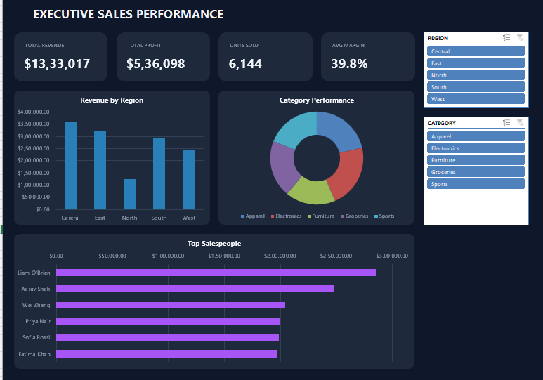
Within seconds, Excel creates:
- Professional dashboard layout
- KPI cards
- Interactive charts
- Dynamic slicers
- Summary section
- Professional formatting
Everything is generated automatically.
Why AI Is Changing Excel Automation
Artificial Intelligence is transforming how professionals work with Excel.
Instead of spending hours writing VBA code manually, AI can help generate the foundation in minutes.
You still need to review and test the generated code, but AI significantly reduces development time and makes automation more accessible to beginners.
For analysts, managers, finance professionals, and Excel enthusiasts, this can dramatically improve productivity.
Who Can Use This Dashboard?
This dashboard is suitable for:
- Business analysts
- Finance professionals
- Accountants
- Data analysts
- Project managers
- HR professionals
- Small business owners
- Students learning Excel
- Freelancers building client dashboards
Watch the Complete Tutorial
The full video demonstrates the entire process—from opening the VBA Editor to generating the finished dashboard.
You’ll see exactly how the dashboard is created and how each dynamic component works together.
Want the VBA Code?
If you’d like to try this dashboard yourself, simply comment “Gemini” on the video.
I’ll share the VBA code so you can build the dashboard on your own and explore how it works.
Final Thoughts
AI is making Excel automation faster, easier, and more accessible than ever before.
With the right prompt and a little experimentation, you can create dashboards that previously required significant VBA experience.
This project is a great example of how Gemini AI can accelerate dashboard development while still giving you complete control over the final result.
If you found this tutorial helpful, don’t forget to support the content by liking the video, subscribing to the channel, and sharing it with others who love Excel automation.
More advanced Excel dashboards, VBA projects, Power Query tutorials, and AI-powered Excel solutions are coming soon.
Stay tuned!


Pingback: SUM Is Great, SUBTOTAL Is Smarter—But This Hidden Excel Function Does Even More - Excel AI Tools and SEO Guides