
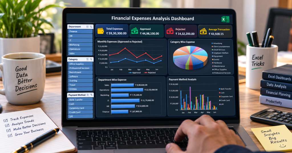

Financial Expenses Analysis Dashboard : Managing business expenses becomes much easier when you can see all your important financial information in one place.
In this tutorial, you will learn how to create a dynamic Financial Expenses Analysis Dashboard in Excel using:
- KPI Cards
- PivotTables
- Interactive Slicers
- Dynamic Charts
- Excel Tables
The best part?
All KPI Cards and Charts are connected with the Slicers.
This means when you select a Department, Category, or Payment Method, your entire dashboard updates automatically.
📥 Download the Excel Dashboard Template
Want to save time?
You can download the complete Financial Expenses Analysis Dashboard Excel file and use it for learning, practice, or customizing your own dashboard.
👇
The download file includes:
✅ Raw Expense Data
✅ Pre-built PivotTables
✅ Dynamic KPI Cards
✅ Interactive Slicers
✅ Professional Charts
✅ Complete Dashboard Layout
What Is a Financial Expenses Analysis Dashboard?
A Financial Expenses Analysis Dashboard is an interactive Excel dashboard that helps you analyze and monitor expenses from a single screen.
Instead of manually checking hundreds or thousands of rows of data, you can quickly understand:
- How much money has been spent
- Total approved expenses
- Total rejected expenses
- Average transaction amount
- Monthly expense trends
- Department-wise expenses
- Category-wise expenses
- Payment method analysis
Using Excel Slicers, you can also filter the entire dashboard with just one click.
Features of This Excel Dashboard
This dashboard includes multiple interactive features.
1. Dynamic KPI Cards
At the top of the dashboard, we have four important KPI Cards.

Total Expense
This KPI displays the total amount of expenses.
Approved Expense
This card shows the total amount of approved expenses.
Rejected Expense
This KPI displays the total rejected expense amount.
Average Transaction
This card calculates the average amount spent per transaction.
The best part is that all these KPI Cards are dynamic.
When you use a Slicer, the KPI values automatically update.
2. Interactive Slicers
The dashboard includes interactive Slicers for easy filtering.
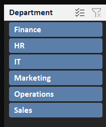
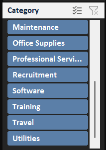
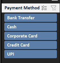
In this example, we are using:
- Department
- Category
- Payment Method
For example, if you select the Finance Department, the entire dashboard will display only Finance-related data.
Similarly, you can select a specific category or payment method.
This makes the dashboard much easier to explore and analyze.
3. Dynamic Charts
The dashboard also includes multiple charts to visualize the expense data.
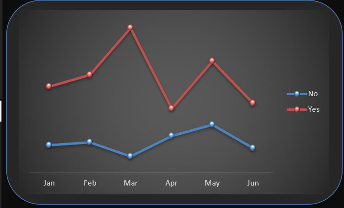
Monthly Expense Analysis
This chart displays monthly expenses and helps identify spending trends over time.
You can also compare:
- Approved Expenses
- Rejected Expenses
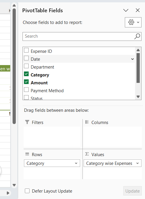
Category-Wise Expense
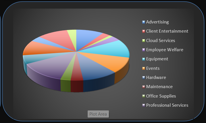
This chart shows which categories are consuming the highest budget.
For example:
- Travel
- Office Supplies
- Software
- Marketing
- Training
- Utilities
This helps businesses identify their major spending areas.
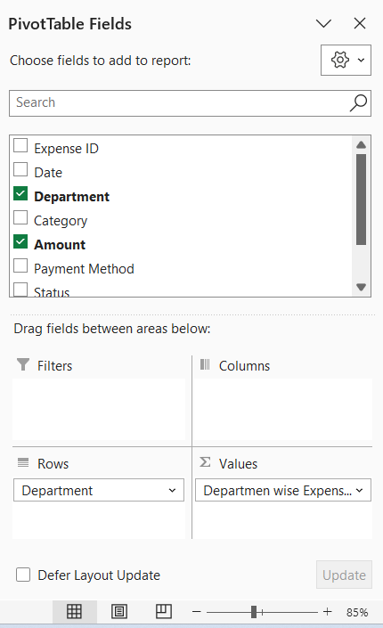
Department-Wise Expense
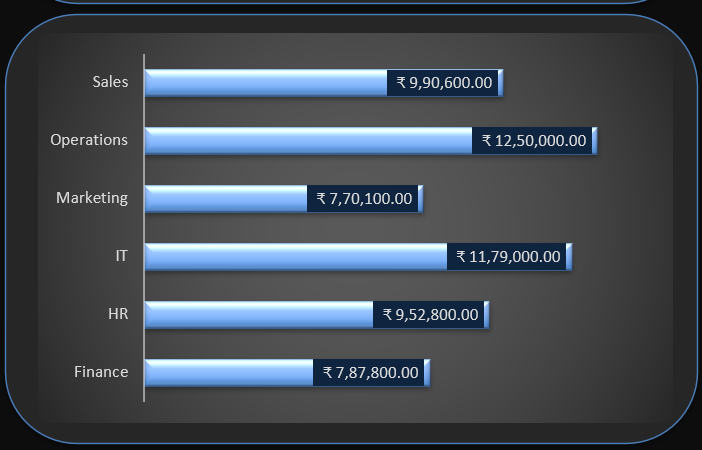
The Department-wise chart helps compare expenses between different departments.
For example:
- HR
- Finance
- Marketing
- Sales
- IT
- Operations
This makes it easy to understand which departments are responsible for the highest expenses.
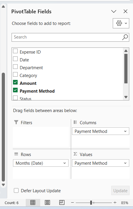
Payment Method Analysis
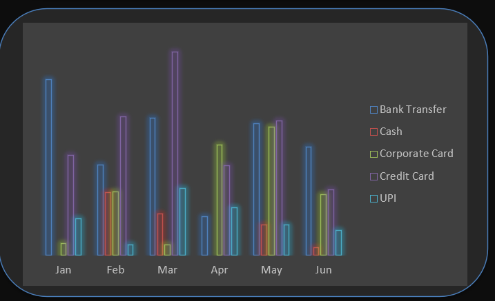
The Payment Method chart helps analyze how expenses are being paid.
For example:
- Credit Card
- Debit Card
- Bank Transfer
- Cash
- UPI
This can provide useful insights into payment behavior and expense management.
Step 1: Prepare Your Raw Data
The first step is to prepare your expense data.
Your data should include columns such as:
| Expense ID | Date | Department | Category | Amount | Payment Method | Status |
|---|---|---|---|---|---|---|
| EXP001 | 01-Jan-2026 | Finance | Travel | 12,500 | Credit Card | Approved |
| EXP002 | 02-Jan-2026 | Marketing | Software | 8,500 | Bank Transfer | Approved |
| EXP003 | 03-Jan-2026 | HR | Training | 5,000 | UPI | Rejected |
You can add more columns depending on your requirements.
For example:
- Employee Name
- Vendor Name
- Location
- Expense Description
- Budget
- Approval Date
Step 2: Convert Raw Data into an Excel Table
Before creating PivotTables, convert your raw data into an Excel Table.
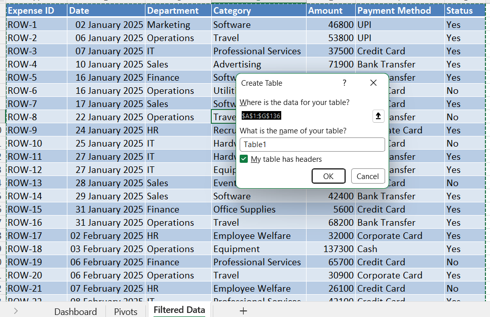
Simply select your data and press:
Ctrl + T
Make sure the option:
My table has headers
is selected.
Click OK.
Why Should You Use an Excel Table?
Using an Excel Table provides several advantages.
Automatic Expansion
When you add new rows, your data table automatically expands.
Better Organization
Tables make your data easier to manage and read.
Easy PivotTable Creation
You can quickly create PivotTables from structured data.
Professional Formatting
Tables automatically apply formatting and filters.
Step 3: Create PivotTables for KPI Cards
Now, let’s create PivotTables for our KPI Cards.
We need four main KPIs.
PivotTable 1: Total Expense
Create a PivotTable that calculates the total expense amount.
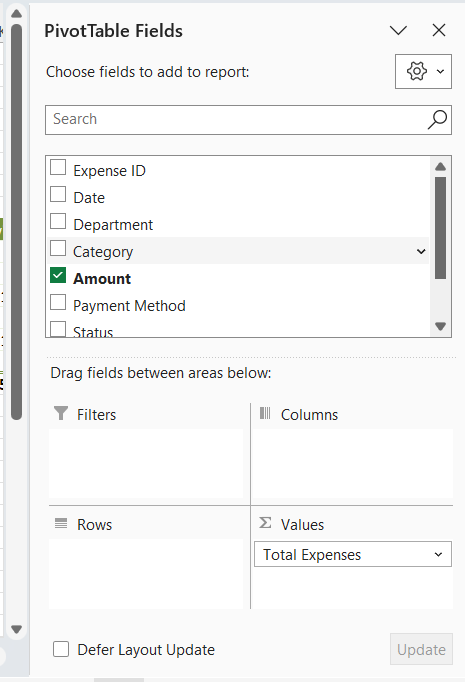
Use:
Amount → Sum
This value will be used for the Total Expense KPI Card.
PivotTable 2: Approved Expense
Create another PivotTable.
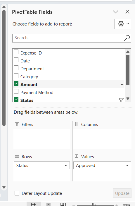
Add:
- Status
- Amount
Filter the Status for:
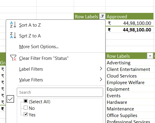
Yes
This will calculate the total approved expense.
PivotTable 3: Rejected Expense
Create another PivotTable for rejected expenses.
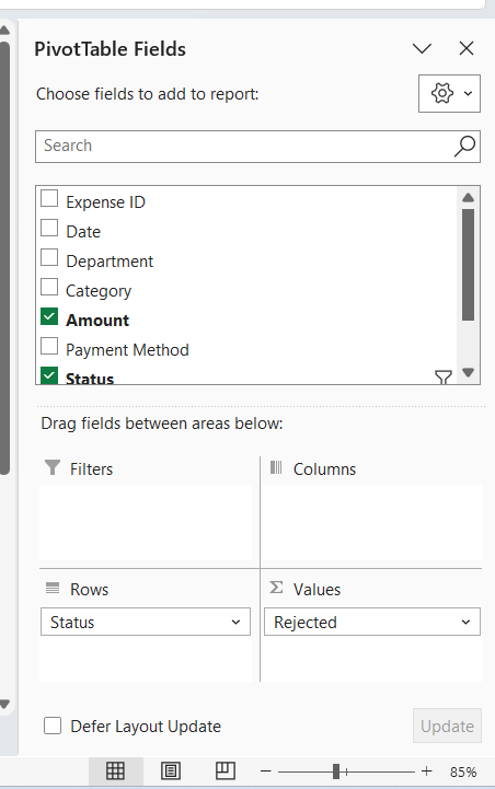
Filter Status for:
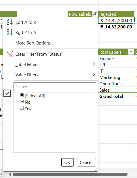
No
This value will be used in the Rejected Expense KPI Card.
PivotTable 4: Average Transaction
For the final KPI, calculate the average transaction amount.
Use:
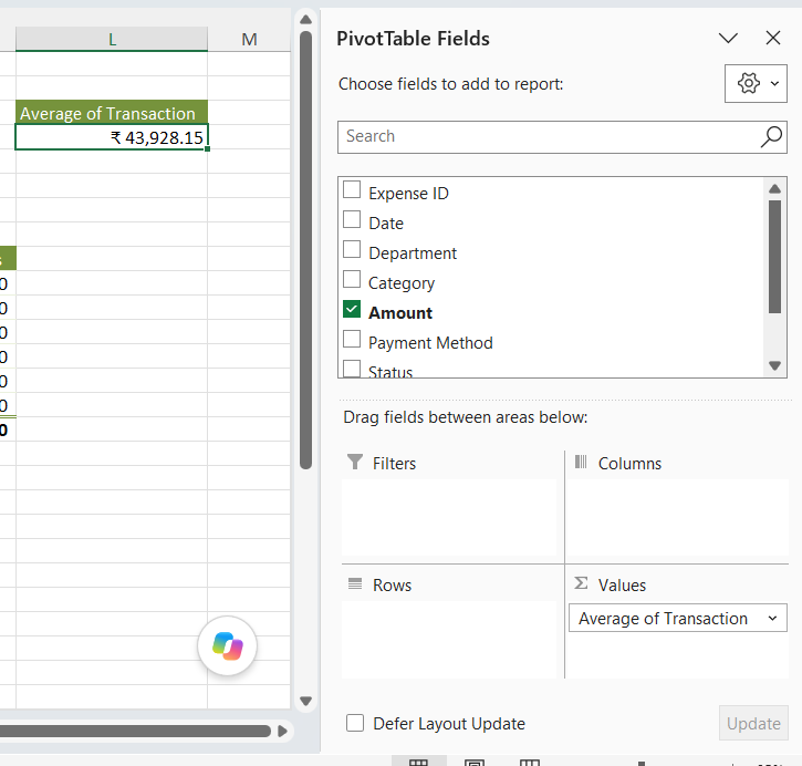
Amount → Average
This will display the average amount spent per transaction.
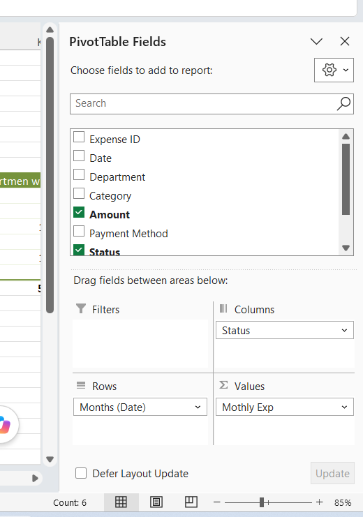
Step 4: Create PivotTables for Charts
Next, create the PivotTables required for your charts.
We will create PivotTables for:
- Monthly Expense
Category-Wise Expense
Department-Wise Expense
Payment Method Analysis
These PivotTables will act as the data source for our dashboard charts.
Step 5: Create Your Dashboard Layout
Now, create a new worksheet and name it:
Dashboard
Add your dashboard title:
Financial Expenses Analysis Dashboard
Create different sections for:
- KPI Cards
- Slicers
- Charts
Before adding charts and data, create a clean layout.
This will help you maintain proper spacing and alignment.
Dashboard Design Tips
To make your Excel Dashboard look more professional:
Use One Color Theme
Choose two or three main colors.
Avoid using too many colors.
Keep Proper Spacing
Leave enough space between KPI Cards and Charts.
Use Consistent Fonts
Use the same font style throughout your dashboard.
Align Everything Properly
Make sure your Cards, Charts, and Slicers are properly aligned.
Avoid Unnecessary Gridlines
You can hide gridlines for a cleaner dashboard design.
Go to:
View → Gridlines
And uncheck the option.
Step 6: Add Dynamic KPI Cards
Now, let’s create our KPI Cards.
You can use:
Insert → Shapes
Create a rectangular shape for each KPI.
Create four KPI Cards:
- Total Expense
- Approved Expense
- Rejected Expense
- Average Transaction
Link KPI Cards with Cells
This is an important step.
First, make sure your PivotTable results are available in cells.
Then select the shape.
Click on the Formula Bar.
Type:
=SheetName!A1
Replace the sheet name and cell reference with your actual cell.
For example:
=Pivot!B5
Now, your shape will display the value from the selected cell.
Important Tip
Make sure your cell references are correct.
If the reference is incorrect, your KPI value may not display properly inside the shape.
Once the first KPI Card is working, you can create the remaining cards and update the cell references.
Step 7: Add Interactive Slicers
Now, let’s add Slicers.
Click on any PivotTable.
Go to:
PivotTable Analyze → Insert Slicer
Select:
- Department
- Category
- Payment Method
Click OK.
Your Slicers are now created.
Step 8: Connect Slicers with All PivotTables
This is one of the most important steps in creating a dynamic Excel Dashboard.
Simply creating Slicers is not enough.
You need to connect them with all your PivotTables.
Right-click on a Slicer.
Select:
Report Connections
Or:
PivotTable Connections
depending on your Excel version.
Now select all the PivotTables that should respond to the Slicer.
Repeat the same process for:
- Department
- Category
- Payment Method
Why Is This Important?
After connecting the Slicers, selecting any option will automatically update:
✅ KPI Cards
✅ PivotTables
✅ Charts
✅ Dashboard Results
This makes your entire dashboard dynamic and interactive.
Step 9: Customize the Slicers
Move the Slicers to your Dashboard sheet.
Resize them according to your layout.
You can also change the Slicer Style.
To do this:
Select Slicer → Slicer → Slicer Styles
Choose a style that matches your dashboard theme.
You can also create your own custom Slicer Style for a completely unique dashboard design.
Step 10: Create Dashboard Charts
Now, let’s create the charts.
Go to your PivotTable sheet.
Select the PivotTable.
Go to:
Insert → PivotChart
Choose the appropriate chart type.
Chart 1: Monthly Expense Analysis
For monthly expenses, you can use:
Column Chart
or:
Line Chart
This helps visualize expense trends over time.
Chart 2: Approved vs Rejected Expense
Use a:
Column Chart
This allows you to easily compare approved and rejected expenses.
Chart 3: Category-Wise Expense
You can use:
Bar Chart
or:
Doughnut Chart
This helps identify the categories with the highest expenses.
Chart 4: Department-Wise Expense
Use a:
Bar Chart
This is useful for comparing multiple departments.
Chart 5: Payment Method Analysis
You can use:
Doughnut Chart
or:
Pie Chart
This provides a quick overview of different payment methods.
Step 11: Move Charts to the Dashboard
Once your charts are ready:
- Select the Chart
- Cut or Copy it
- Move to the Dashboard sheet
- Resize the Chart
- Position it correctly
Make sure all charts are properly aligned.
Try to maintain consistent spacing throughout the dashboard.
Step 12: Test Your Dynamic Dashboard
Now comes the most important part.
Test your dashboard.
Select different values from the Slicers.
For example:
Select a Department
Choose:
Marketing
Your KPI Cards should automatically update.
Your charts should also update.
Select a Category
Choose:
Travel
The dashboard should now display only Travel-related expenses.
Select a Payment Method
Choose:
Credit Card
Again, all connected KPIs and Charts should update automatically.
If everything updates correctly, congratulations!
Your dynamic Excel Dashboard is working successfully.
Final Dashboard Features
Our completed Financial Expenses Analysis Dashboard includes:
📊 KPI Cards
- Total Expense
- Approved Expense
- Rejected Expense
- Average Transaction
🎯 Interactive Slicers
- Department
- Category
- Payment Method
📈 Dynamic Charts
- Monthly Expense Analysis
- Approved vs Rejected Expenses
- Category-Wise Expenses
- Department-Wise Expenses
- Payment Method Analysis
Everything is connected and dynamic.
📥 Download the Complete Excel Dashboard
Don’t want to create everything from scratch?
You can download the complete Financial Expenses Analysis Dashboard Excel Template.
The file includes:
✔ Complete Raw Data
Ready-to-use expense data for practice.
✔ Pre-built PivotTables
All PivotTables are already created.
✔ Dynamic KPI Cards
Fully linked KPI Cards.
✔ Interactive Slicers
Ready to filter the entire dashboard.
✔ Professional Charts
Multiple charts with dashboard formatting.
✔ Editable Dashboard
You can customize:
- Colors
- Titles
- Charts
- Data
- Departments
- Categories
- Payment Methods
👉 Download the Financial Expenses Analysis Dashboard
Who Can Use This Excel Dashboard?
This dashboard is useful for:
- Business Owners
- Finance Teams
- Accountants
- Financial Analysts
- Excel Learners
- Students
- Small Businesses
- Expense Managers
- Data Analysts
You can also customize this template for your own company or project.
Frequently Asked Questions
Is this Excel Dashboard dynamic?
Yes.
The KPI Cards and Charts automatically update when you use the Slicers.
Which Excel version is required?
This dashboard works best with:
Microsoft Excel 365
You can also use newer versions of Microsoft Excel that support PivotTables and Slicers.
Can I add more KPIs?
Yes.
You can easily add additional KPIs such as:
- Total Transactions
- Maximum Expense
- Minimum Expense
- Pending Expenses
- Budget Variance
- Expense Growth
Can I add more Slicers?
Yes.
You can add Slicers for:
- Year
- Month
- Employee
- Vendor
- Location
- Expense Type
- Approval Status
Can I customize the Dashboard?
Absolutely.
You can change:
- Dashboard Colors
- Fonts
- KPI Cards
- Chart Types
- Slicer Styles
- Data
- Layout
Final Thoughts
Creating an Excel Dashboard is one of the best ways to turn raw data into meaningful insights.
With PivotTables, Slicers, KPI Cards, and Charts, you can create powerful dashboards without using complex formulas or advanced programming.
The most important feature of this dashboard is its dynamic behavior.
When a user selects a value from a Slicer, the connected PivotTables update automatically.
As a result:
KPI Cards update.
Charts update.
The entire dashboard updates.
This makes the dashboard interactive, professional, and extremely useful for financial analysis.
📥 Ready to Use the Dashboard?
Save time and download the complete Excel file.
👉 [Download Financial Expenses Analysis Dashboard – Excel Template]
The template is fully editable and perfect for learning Excel Dashboard creation.
🎥 Watch the Complete Video Tutorial
Want to see how this dashboard was created step by step?
https://www.youtube.com/watch?v=cBoMRthQWMw
Watch our complete video tutorial and learn how to create:
- Dynamic KPI Cards
- PivotTables
- Interactive Slicers
- Professional Charts
- Complete Excel Dashboards
Don’t forget to subscribe to Excel Tricks for more Excel tutorials, dashboard ideas, formulas, Power Query, VBA, and Microsoft Excel 365 tips.
Keep Learning. Keep Growing. Keep Mastering Excel!

