
Top 5 Dashboard Design Mistakes (And How to Fix Them) in 2026
Discover the top five dashboard design mistakes that make reports confusing and ineffective. Learn proven dashboard design best practices to build clean, interactive, and business-ready dashboards.
Top 5 Dashboard Design Mistakes That Ruin Data Insights (And How to Fix Them)
A dashboard is supposed to make decision-making easier. Yet many dashboards do exactly the opposite—they overwhelm users with too much information, confusing visuals, and poor layouts.
Whether you’re building dashboards in Excel, Power BI, Tableau, Google Looker Studio, or any other business intelligence tool, following good dashboard design principles is essential.
A well-designed dashboard allows executives to spot trends in seconds, analysts to identify issues faster, and teams to make data-driven decisions with confidence.
In this guide, we’ll explore the five most common dashboard design mistakes, why they happen, and practical ways to avoid them.
Why Dashboard Design Matters
Imagine opening a dashboard with:
- 25 colorful charts
- Tiny fonts
- Random colors
- No clear hierarchy
- Numbers everywhere
Instead of helping users, the dashboard creates confusion.
Good dashboard design should answer three questions immediately:
- What is happening?
- Why is it happening?
- What action should I take?
If users cannot answer these questions within a few seconds, the dashboard needs improvement.
Mistake #1: Showing Too Much Information
The Problem
Many beginners think adding more charts makes a dashboard more useful.
In reality, it creates information overload.
Common examples include:
- 20+ KPIs on one page
- Multiple pie charts
- Duplicate metrics
- Too many tables
- Every filter visible at once
Users spend more time searching than understanding.
Why It’s Bad
The human brain processes visual information quickly—but only when it’s organized.
Too many elements compete for attention.
Important insights become hidden among less important information.
Better Approach
Instead of showing everything:
- Display only critical KPIs
- Use drill-down pages for details
- Group related metrics
- Remove unnecessary visuals
Example
Instead of:
- Revenue
- Revenue Growth
- Revenue by Product
- Revenue by State
- Revenue by Customer
- Revenue by Month
- Revenue Forecast
Show:
- Total Revenue
- Growth %
- Revenue Trend
- Top Products
Allow users to explore further if needed.
Mistake #2: Using Too Many Colors
The Problem
Bright dashboards may look attractive initially but quickly become distracting.
Many dashboards use:
- Red
- Green
- Blue
- Purple
- Yellow
- Orange
- Pink
—all on the same page.
Instead of highlighting important information, every chart competes for attention.
Why It’s Bad
Colors should communicate meaning—not decoration.
Too many colors reduce readability.
They also make dashboards look unprofessional.
Better Approach
Follow a consistent color palette.
Example:
Primary Color:
Blue
Positive:
Green
Negative:
Red
Neutral:
Gray
Highlight:
Orange
Keep backgrounds light and charts consistent.
Users should immediately recognize what each color represents.
Mistake #3: Choosing the Wrong Chart Type
The Problem
Every chart has a purpose.
Using the wrong chart often hides valuable insights.
Examples include:
Pie Chart for 20 categories
3D Charts
Gauge Charts for everything
Stacked charts with too many segments
Bubble charts without context
Better Alternatives
Use:
Bar Charts
→ Compare categories
Line Charts
→ Show trends
Column Charts
→ Monthly comparisons
Maps
→ Geographic analysis
Cards
→ KPIs
Heat Maps
→ Identify patterns
Tables
→ Detailed records
The simplest chart is often the most effective.
Mistake #4: Ignoring Visual Hierarchy
The Problem
Users don’t know where to look first.
Every element has the same size.
Every chart has equal importance.
Nothing stands out.
Good Dashboard Layout
Follow a logical reading order.
Top:
KPIs
Middle:
Main trends
Bottom:
Detailed analysis
Right side:
Filters
This layout helps users understand the dashboard naturally.
Prioritize Key Metrics
Large cards for:
Revenue
Profit
Orders
Customers
Smaller visuals for supporting information.
Remember:
Everything cannot be equally important.
Mistake #5: Forgetting the End User
The Problem
Many dashboards are built for the creator—not the audience.
Executives need summaries.
Managers need trends.
Analysts need detailed data.
Finance teams need calculations.
Sales teams need targets.
One dashboard rarely fits everyone.
Better Approach
Know your audience before building.
Ask questions like:
Who will use this dashboard?
What decisions will they make?
Which KPIs matter most?
How often will they use it?
Will they access it on desktop or mobile?
Design around user needs—not personal preferences.
Bonus Tips for Better Dashboard Design
Here are several professional dashboard design practices used by successful analysts.
Keep It Clean
Avoid unnecessary borders.
Reduce gridlines.
Use white space.
Simplify labels.
Maintain Consistency
Use:
Same fonts
Same colors
Same spacing
Same alignment
Same chart styles
Consistency improves trust and readability.
Add Interactive Filters
Interactive dashboards help users explore data quickly.
Useful filters include:
- Date Range
- Region
- Product Category
- Department
- Salesperson
- Customer
Avoid adding too many filters on the main page.
Highlight Important Changes
Use conditional formatting to show:
▲ Growth
▼ Decline
Target Achieved
Risk Areas
This allows users to identify issues instantly.
Optimize for Mobile
Many executives review dashboards on phones or tablets.
Ensure:
- Large fonts
- Responsive layout
- Minimal scrolling
- Touch-friendly filters
Mobile-friendly dashboards improve accessibility.
Dashboard Design Checklist
Before publishing your dashboard, verify the following:
✅ Shows only essential KPIs
✅ Uses a consistent color palette
✅ Charts match the data
✅ Clear visual hierarchy
✅ Easy-to-read fonts
✅ Interactive filters
✅ Responsive layout
✅ No unnecessary clutter
✅ Important metrics highlighted
✅ Audience-focused design
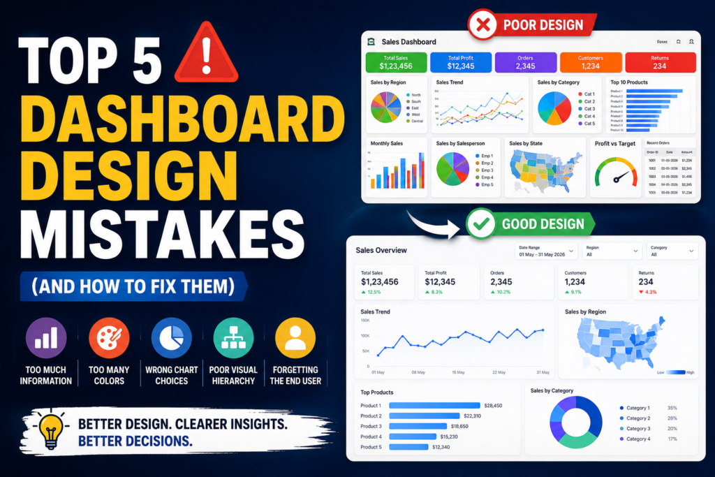
Real-World Example
Imagine a sales dashboard.
Poor Dashboard
- 18 charts
- Rainbow colors
- Tiny fonts
- 3D pie charts
- Five tables
- No KPI cards
Finding insights takes several minutes.
Improved Dashboard
Top Row:
Revenue
Profit
Orders
Customers
Middle:
Monthly Sales Trend
Regional Performance
Bottom:
Top Products
Sales by Category
Interactive Filters:
Date
Region
Category
Within seconds, decision-makers know how the business is performing.
Common Dashboard Design Questions
How many charts should a dashboard have?
There is no fixed rule, but most effective dashboards contain 5–10 meaningful visuals supported by KPI cards and filters rather than dozens of charts.
Which colors work best for dashboards?
Use a neutral background with a limited color palette. Reserve bright colors for alerts, exceptions, or key insights.
Are pie charts bad?
Not always. Pie charts work well for showing a few categories (typically fewer than six). For comparing many categories, bar charts are usually easier to read.
Should every dashboard be interactive?
Interactivity is helpful when it supports the user’s goals. Include filters, slicers, or drill-downs only when they simplify analysis rather than adding complexity.
Final Thoughts
A dashboard is more than a collection of charts—it’s a decision-making tool.
The best dashboards communicate the right information at the right time with minimal effort from the user.
By avoiding these five common mistakes—information overload, excessive colors, poor chart choices, weak visual hierarchy, and ignoring user needs—you can build dashboards that are cleaner, faster to understand, and far more valuable.
Whether you’re creating dashboards in Excel, Power BI, Tableau, or Looker Studio, remember that simplicity, clarity, and usability will always outperform unnecessary complexity.
Key Takeaways
- Focus on the most important KPIs.
- Use a consistent and meaningful color palette.
- Choose charts that match the story your data tells.
- Create a clear visual hierarchy.
- Design every dashboard around the needs of its users.
- Keep layouts clean, interactive, and easy to navigate.
When users can understand a dashboard in under 10 seconds, you’ve created a dashboard that truly delivers insights.
Suggested Internal Links
- Excel Dashboard Tutorial for Beginners
- Dynamic Excel Dashboard with Pivot Tables
- Power Query Dashboard Automation Guide
- Interactive HR Dashboard in Excel
- Sales Dashboard Design Best Practices
- KPI Dashboard Examples for Business Reporting
- Dashboard Color Palette Guide
- Power BI vs Excel Dashboards
Suggested Image Alt Text: Clean business dashboard comparing poor vs. good dashboard design with KPIs, charts, and color hierarchy.
Focus Keywords: dashboard design mistakes, dashboard best practices, dashboard design tips, Excel dashboard design, KPI dashboard, dashboard visualization, business dashboard, interactive dashboard, dashboard UI, dashboard UX.


Pingback: Free Excel Dashboard Generator | Create Interactive Dashboards in 10 Seconds - Excel AI Tools and SEO Guides