
Turn Raw Sales Data into an Executive-Level Dashboard
Sales Dashboard: Imagine opening an Excel workbook and instantly seeing total revenue, customer growth, top-performing sales representatives, and country-wise performance—all on a single screen.
That’s exactly what a professional sales dashboard does.
Whether you’re a business analyst, sales manager, freelancer, or Excel enthusiast, dashboards help transform messy data into meaningful insights that support smarter decisions.
In this guide, you’ll learn how to build a modern Global Sales Dashboard in Excel using Pivot Tables, Pivot Charts, KPI Cards, and a premium dark theme design.
By the end, you’ll have a dashboard that looks like it came straight out of a business intelligence tool.
Why Every Business Needs a Sales Dashboard
Let’s consider a common scenario.
A sales manager receives thousands of transaction records every month. Finding answers to questions like:
- Which country generated the most revenue?
- Are sales growing month-over-month?
- Which sales representatives are driving results?
- How many customers have been acquired?
can take hours when working directly with raw data.
A dashboard solves this problem by displaying everything visually and automatically updating when data changes.
Benefits of a Sales Dashboard
✅ Monitor business performance instantly
✅ Track revenue trends
✅ Identify top-performing sales representatives
✅ Measure customer growth
✅ Improve decision-making
✅ Save hours of manual reporting
Step 1: Prepare and Organize Your Raw Data
Before creating any dashboard, the foundation must be strong.
Convert Your Data into an Excel Table
Select your dataset and convert it into a structured Excel Table.
Why is this important?
Excel Tables automatically expand when new records are added and work perfectly with Pivot Tables.
After creating the table, rename it:
SalesData
This small step makes your dashboard easier to maintain and more professional.
Step 2: Create the Required Pivot Tables
Pivot Tables will act as the engine behind the dashboard.
Instead of calculating everything manually, Pivot Tables summarize data instantly.
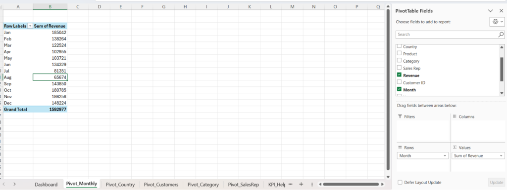
Monthly Revenue Trend Pivot
Create a Pivot Table called:
Pivot_Monthly
Fields:
- Rows → Month
- Values → Revenue
This Pivot Table will power your revenue trend chart.
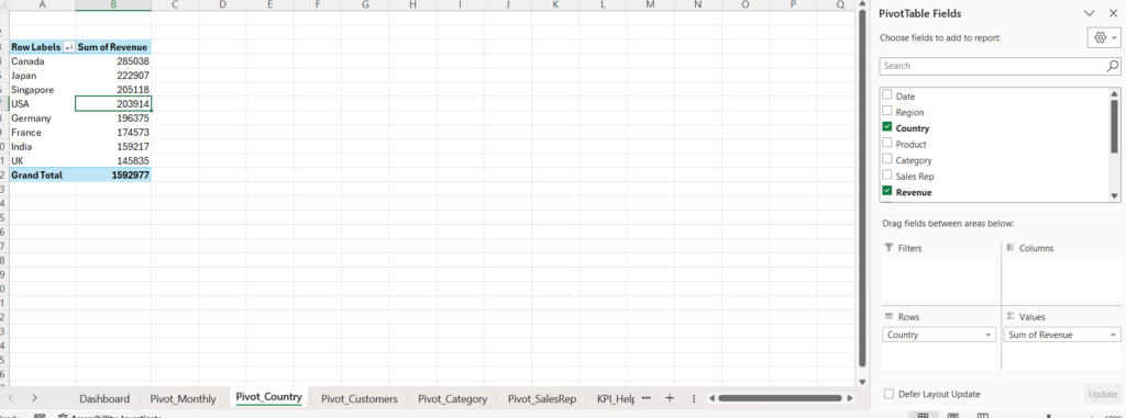
Revenue by Country Pivot
Create:
Pivot_Country
Fields:
- Rows → Country
- Values → Revenue
This allows you to compare revenue performance across different countries.
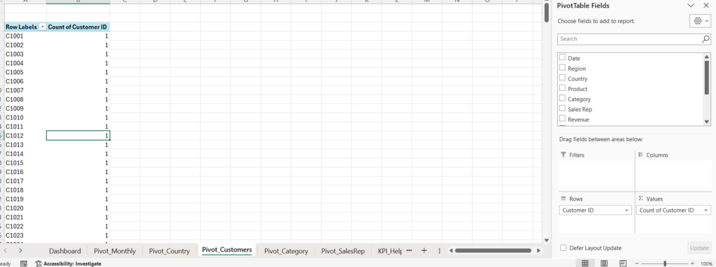
Customer Count Pivot
Create:
Pivot_Customers
Fields:
- Rows → Customer ID
- Values → Customer ID
This Pivot Table helps calculate the total number of customers.
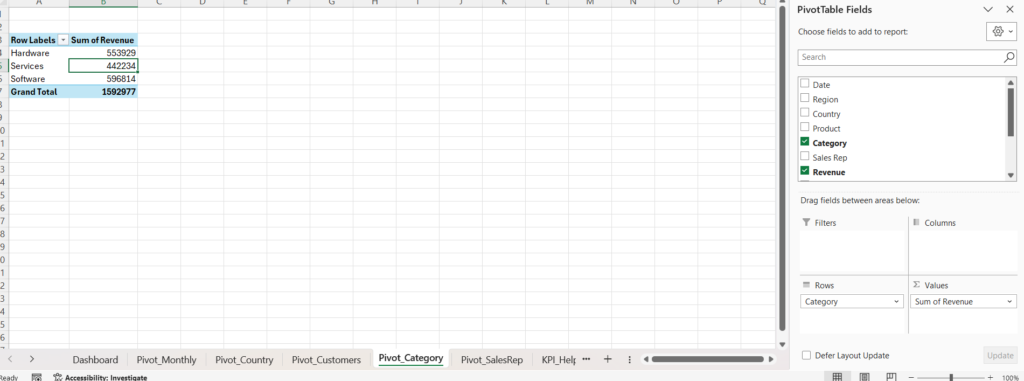
Category Performance Pivot
Create:
Pivot_Category
Fields:
- Rows → Category
- Values → Revenue
Useful for future category analysis.
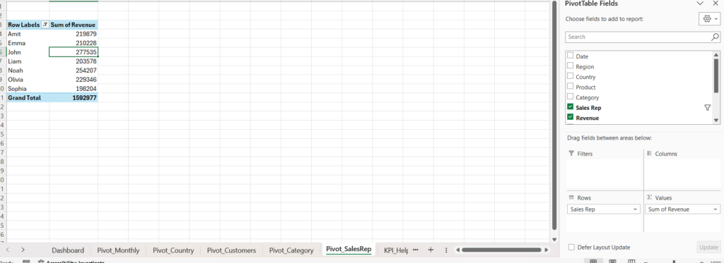
Sales Representative Performance Pivot
Create:
Pivot_SalesRep
Fields:
- Rows → Sales Rep
- Values → Revenue
This will be used for the Top 10 Sales Representatives chart.
Step 3: Create KPI Calculations
A dashboard without KPIs is like a car without a speedometer.
Create a worksheet called:
KPI_Helper
This sheet will store important business metrics.
KPI 1: Total Revenue
Use GETPIVOTDATA to pull revenue directly from the Pivot Table.
This ensures the dashboard updates automatically whenever data changes.
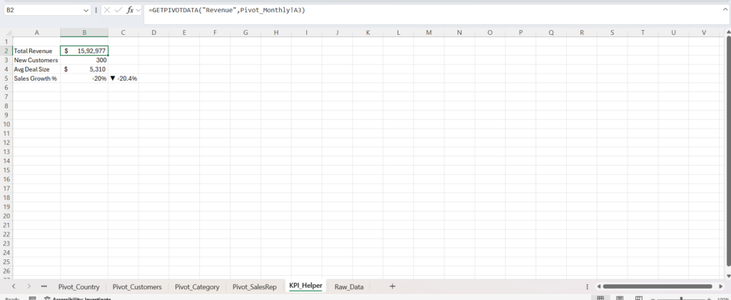
KPI 2: New Customers
Calculate the total customer count using the customer Pivot Table.
This KPI shows customer acquisition performance.
KPI 3: Average Deal Size
Average Deal Size helps determine how much revenue is generated per customer.
A higher value usually indicates stronger sales efficiency.
KPI 4: Sales Growth Percentage
Sales Growth measures whether revenue is increasing compared to the previous period.
Business leaders often look at this metric first because it quickly reveals company momentum.
Step 4: Design the Dashboard Layout
Now comes the exciting part.
Most Excel dashboards fail because they focus only on calculations and ignore design.
A great dashboard must be both functional and visually appealing.
Create a new worksheet named:
Dashboard
Then:
- Remove gridlines
- Set consistent row heights
- Create a structured column layout
- Lock cells if desired
This creates a cleaner user experience.
Step 5: Create a Premium Dark Theme Dashboard
Modern BI tools use dark themes because they reduce visual clutter and make charts stand out.
Insert a large rectangle shape covering the dashboard area.
Apply a dark gradient background using shades of:
- Deep Navy
- Slate Blue
- Charcoal
This creates a sleek executive-style appearance.
Pro Tip
Set the background shape to:
Don’t Move or Size with Cells
This prevents accidental movement while editing.
Step 6: Add a Professional Dashboard Header
The title is the first thing users notice.
Create a centered title:
GLOBAL SALES DASHBOARD
Recommended formatting:
- Font: Segoe UI
- Bold
- Large font size
- Light text color
For additional visual impact, insert a globe icon beside the title.
This immediately communicates that the dashboard contains global business insights.
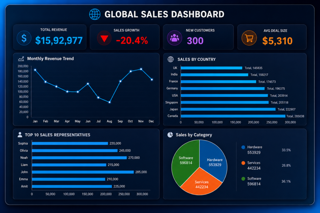
Step 7: Build KPI Cards
KPI Cards are the heart of the dashboard.
Place four cards across the top section.
Total Revenue
Shows overall sales performance.
Use a bright blue highlight color to make it stand out.
Sales Growth
Shows business momentum and trend direction.
A critical metric for management reviews.
New Customers
Measures customer acquisition success.
Purple tones work well for this KPI.
Average Deal Size
Displays revenue generated per customer.
Orange is often used because it attracts attention without overpowering the design.
Design Tips for KPI Cards
Use:
- Rounded rectangles
- Soft shadows
- No borders
- Large numbers
- Smaller descriptive labels
This creates a modern dashboard appearance similar to Power BI and Tableau.
Step 8: Create the Monthly Revenue Trend Chart
Every executive dashboard should answer one question:
“How is revenue changing over time?”
Create a Pivot Chart from the Monthly Revenue Pivot Table.
Choose:
Line Chart with Markers
This chart quickly reveals:
- Growth trends
- Seasonal patterns
- Revenue fluctuations
Recommended Formatting
- Dark chart background
- Bright blue line
- No unnecessary gridlines
- Clear chart title
The cleaner the chart, the easier it is to understand.
Step 9: Visualize Sales Performance by Country
Next, create a Country Revenue comparison chart.
Sort countries from highest to lowest revenue.
Insert:
Clustered Bar Chart
This chart immediately highlights:
- Best-performing countries
- Weak-performing regions
- Geographic sales opportunities
Keep the design minimal.
Remove:
- Legends
- Extra gridlines
- Unnecessary chart elements
Simple dashboards are easier to read.
Step 10: Highlight Top 10 Sales Representatives
Every organization wants to know who its top performers are.
Apply a Top 10 filter to the Sales Representative Pivot Table.
Then create a:
Clustered Bar Chart
This visual instantly identifies:
- Star performers
- Revenue leaders
- Sales team contribution
Managers can use this insight for:
- Recognition programs
- Incentives
- Performance reviews
- Training opportunities
Dashboard Design Principles Used
This dashboard follows several professional dashboard design rules:
1. Focus on Important Metrics
Only key business indicators are displayed.
2. Minimize Visual Noise
Unnecessary chart elements are removed.
3. Maintain Consistent Colors
A unified color scheme improves readability.
4. Prioritize User Experience
Information is organized logically from top to bottom.
5. Use Data Storytelling
The dashboard tells a complete business story:
Revenue → Growth → Customers → Geography → Sales Team
Final Dashboard Outcome
After completing all steps, you’ll have a fully interactive Global Sales Dashboard capable of showing:
- Total Revenue
- Sales Growth %
- New Customers
- Average Deal Size
- Monthly Revenue Trend
- Revenue by Country
- Top 10 Sales Representatives
The best part?
Whenever new sales records are added, simply refresh the Pivot Tables and the entire dashboard updates automatically.
Download Section
Conclusion
Excel remains one of the most powerful business intelligence tools when used correctly.
By combining Pivot Tables, GETPIVOTDATA formulas, KPI Cards, and professionally styled Pivot Charts, you can build dashboards that rival expensive reporting software.
A well-designed Global Sales Dashboard doesn’t just look impressive—it helps businesses uncover trends, identify opportunities, and make smarter decisions faster.
Start with your raw sales data today, follow the steps outlined above, and transform ordinary spreadsheets into executive-level insights.


Pingback: How to Create an Interactive Excel Sales Dashboard from Raw Data (Step-by-Step Guide-2026) - Excel AI Tools and SEO Guides
Pingback: Inventory Management Is Broken for Many Businesses — This Excel VBA Dashboard Changes Everything 2026 - Excel AI Tools and SEO Guides