
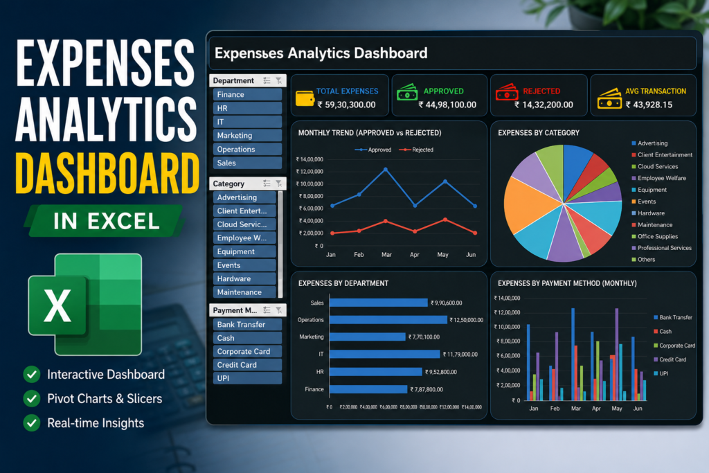

Learn how to build an interactive Expenses Analytics Dashboard in Excel using Pivot Tables, Pivot Charts, KPI cards, and slicers with this step-by-step tutorial.
Managing expenses in Excel is easy. Understanding where the money is going is the difficult part.
A spreadsheet with hundreds or thousands of transactions can quickly become overwhelming. You may have dates, departments, categories, payment methods, approval statuses, and amounts—but finding meaningful insights from all that data takes time.
That is where an interactive Excel dashboard becomes useful.
In this tutorial, I’ll show you how to build an Expenses Analytics Dashboard in Excel using:
- Pivot Tables
- Pivot Charts
- Slicers
- KPI Cards
- Excel Shapes
- Interactive filters
By the end, you’ll have a dashboard that allows you to filter the entire report with just a few clicks.
What makes this dashboard powerful is not the design alone. The real power comes from connecting your raw data, Pivot Tables, charts, and slicers into one interactive reporting system.
What You’ll Build
The final dashboard will include:
- Total Expenses
- Approved Expenses
- Rejected Expenses
- Average Transaction Value
- Monthly Expense Trend
- Category-wise Expense Analysis
- Department-wise Expenses
- Payment Method Analysis
- Interactive slicers for filtering the entire dashboard
The overall structure looks like this:
RAW DATA
↓
EXCEL TABLE
↓
PIVOT TABLES
↓
PIVOT CHARTS + KPI CALCULATIONS
↓
SLICERS
↓
INTERACTIVE DASHBOARD
Step 1: Prepare Your Raw Expense Data
Before creating any dashboard, make sure your source data is properly organized.
Your data should look something like this:
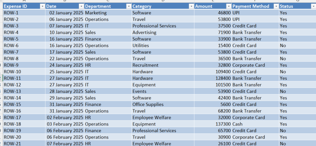
Recommended columns
For this dashboard, use:
- Date
- Month
- Department
- Category
- Payment Method
- Status
- Amount
Convert the data into an Excel Table
This step is highly recommended.
- Select your entire dataset.
- Press Ctrl + T.
- Check My table has headers.
- Click OK.
Using an Excel Table makes your dashboard easier to maintain because new rows can be included when you refresh your Pivot Tables.
Step 2: Create a Separate Pivot Table Sheet
Don’t build all your calculations directly on the Dashboard sheet.
Instead, create a separate worksheet called:
Pivots
This will act as the backend of your dashboard.
Your workbook structure can look like this:
Sheet 1 — Filtered Data
Your original expense transactions.
Sheet 2 — Pivots
All Pivot Tables and calculations.
Sheet 3 — Dashboard
The final interactive visual report.
This structure keeps your workbook much cleaner and easier to manage.

Step 3: Create the Total Expenses KPI
The first KPI shows the total amount spent.
Create a Pivot Table
- Select your Excel Table.
- Go to Insert → PivotTable.
- Choose the Pivots sheet.
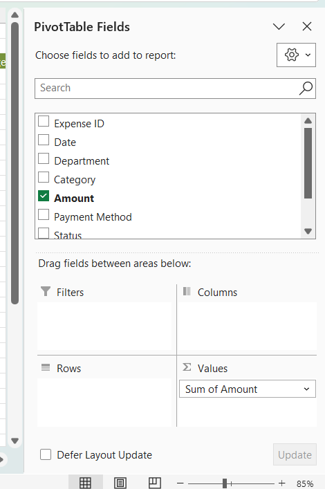
In the PivotTable Fields panel:
Values
Add:
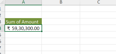
Amount → SumYou will now have your total expense value.
For example:
₹59,30,300.00This value will later be displayed in your Total Expenses KPI card.
Step 4: Create the Approved Expenses KPI
Create another Pivot Table.
This time, you need to calculate the total amount for approved transactions.
Pivot Table setup
Use:
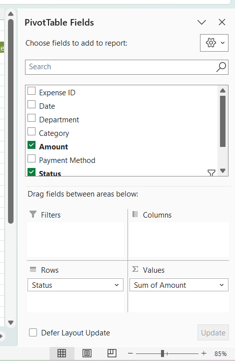
Rows or Filter
Rows-StatusSelect:
ApprovedValues
Amount → SumThis gives you the total approved expenses.
For example:
₹44,98,100.00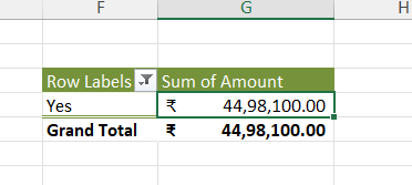
Step 5: Create the Rejected Expenses KPI
Create another Pivot Table for rejected transactions.
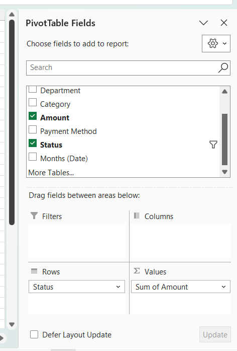
Setup
Filter:
Rows-StatusThen add:
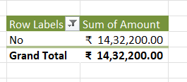
Amount → SumThis gives you the rejected expense amount.
For example:
₹14,32,200.00Step 6: Create the Average Transaction KPI
Now create the fourth KPI.
Add a new Pivot Table and configure:
Values
Amount → AverageYou will get the average transaction value.
For example:
₹43,928.15Now your four main KPIs are ready:
| KPI | Calculation |
|---|---|
| Total Expenses | Sum of Amount |
| Approved | Sum of Approved Amount |
| Rejected | Sum of Rejected Amount |
| Average Transaction | Average of Amount |
Step 7: Build the Monthly Expense Trend
The first major chart in the dashboard shows how expenses change over time.
Create a Pivot Table with the following structure.
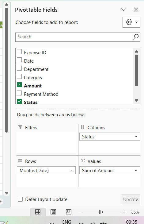
Rows
MonthColumns
StatusValues
Amount → Sum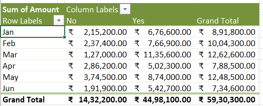
Your Pivot Table may look like this
Create the Line Chart
- Click anywhere inside the Pivot Table.
- Go to Insert → Chart.
- Select:
Line with Markers
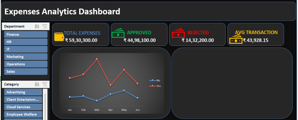
You will now have a chart showing monthly trends for approved and rejected expenses.
This chart makes it easy to identify:
- Months with high spending
- Changes in approved expenses
- Changes in rejected expenses
- Unusual spikes
Step 8: Create the Category-wise Expense Analysis
Now let’s see where the money is being spent.
Create another Pivot Table.
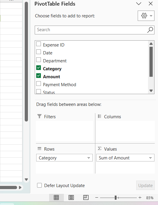
Rows
CategoryValues
Amount → SumYour categories may include:
- Advertising
- Client Entertainment
- Cloud Services
- Employee Welfare
- Equipment
- Events
- Hardware
- Maintenance
- Office Supplies
- Professional Services
- Recruitment
- Software
- Training
- Travel
- Utilities
Create the Pie Chart
Select the Pivot Table and go to:
Insert → PivotChart → Pie Chart
Place the legend on the right side.
This chart helps answer an important business question:
Which expense categories are consuming the largest share of the budget?
Step 9: Create the Department-wise Expense Chart
Next, let’s compare expenses between departments.
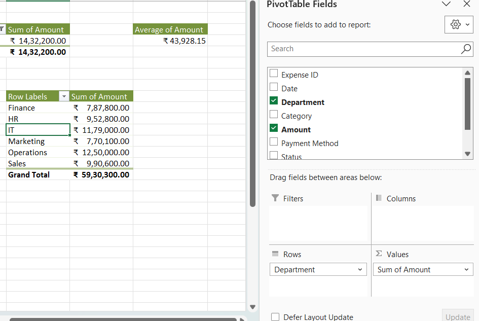
Create a Pivot Table.
Rows
DepartmentValues
Amount → SumYour departments might include:
- Finance
- HR
- IT
- Marketing
- Operations
- Sales
Now create a:
Clustered Bar Chart
Go to:
Insert → PivotChart → Bar → Clustered Bar
A horizontal bar chart works particularly well here because department names remain easy to read.
Add data labels if you want users to see the exact amount.
Step 10: Create the Payment Method Analysis
The final chart compares spending across different payment methods.
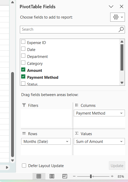
Create a Pivot Table with:
Rows
MonthColumns
Payment MethodValues
Amount → SumYour payment methods might include:
- Bank Transfer
- Cash
- Corporate Card
- Credit Card
- UPI
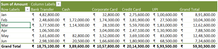
Now insert:
Clustered Column Chart
This allows you to compare payment methods across multiple months.
It’s particularly useful for identifying questions such as:
- Which payment method is used most frequently?
- How does payment behavior change each month?
- Are certain payment methods responsible for higher expenses?
Step 11: Create the Dashboard Layout
Once all your Pivot Tables and charts are ready, create a new sheet called:
Dashboard
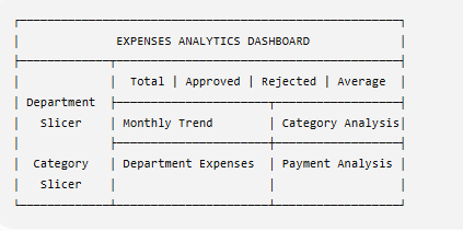
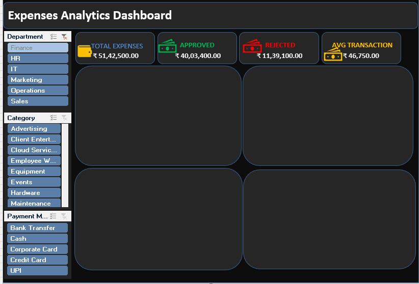
Instead of relying on normal Excel cells for the design, use Shapes to create a cleaner layout.
A simple dashboard structure could look like this:
Step 12: Add the Main Dashboard Background
Go to:
Insert → Shapes → Rectangle
Create one large rectangle that covers the dashboard area.
Then add smaller rounded rectangles for:
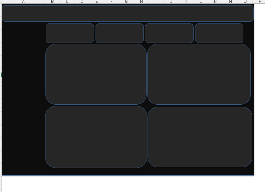
- KPI Cards
- Charts
- Dashboard Header
A simple design rule
Use the same:
- Border style
- Corner radius
- Font
- Spacing
throughout the dashboard.
Consistency is what makes an Excel dashboard look professional.
Step 13: Create the KPI Cards
Create four rounded rectangles at the top.
Your cards can display:
💳 Total Expenses
₹59,30,300.00✓ Approved
₹44,98,100.00✕ Rejected
₹14,32,200.00▣ Average Transaction
₹43,928.15Important: Don’t manually type the values
The KPI values should come from your Pivot Table calculations.
You can link a cell or text box to a Pivot Table result.
For example:
=Pivots!B4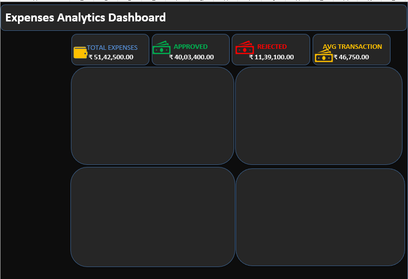
Step 14: Add Interactive Slicers
This is where your dashboard becomes truly interactive.
Select one of your Pivot Tables and go to:
PivotTable Analyze → Insert Slicer
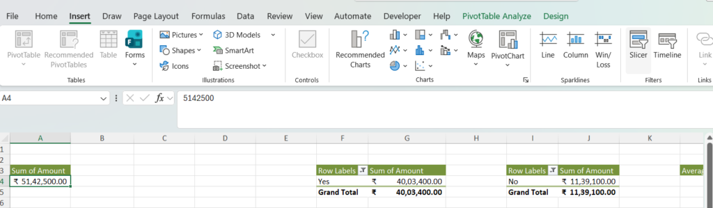
Create slicers for:
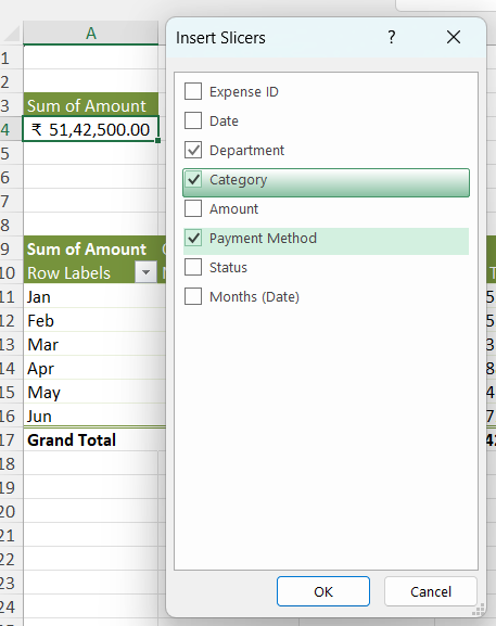
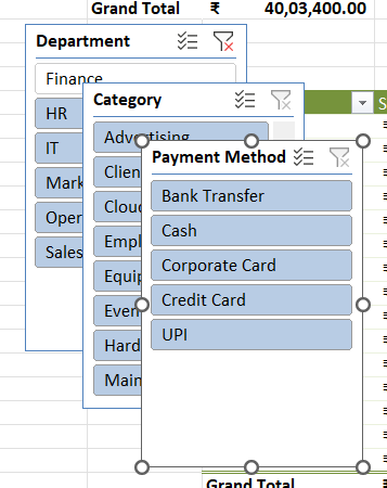
Department
Examples:
- Finance
- HR
- IT
- Marketing
- Operations
- Sales
Category
Examples:
- Advertising
- Software
- Hardware
- Events
- Travel
Payment Method
Examples:
- Bank Transfer
- Cash
- Corporate Card
- Credit Card
- UPI
Move the slicers to the left side of your dashboard.
Step 15: Connect the Slicers to Every Pivot Table
This is the most important step in the entire process.
A slicer will not automatically control every Pivot Table.
You need to connect it manually.
How to do it
- Right-click the slicer.
- Select Report Connections or PivotTable Connections.
- Select all the Pivot Tables you want the slicer to control.
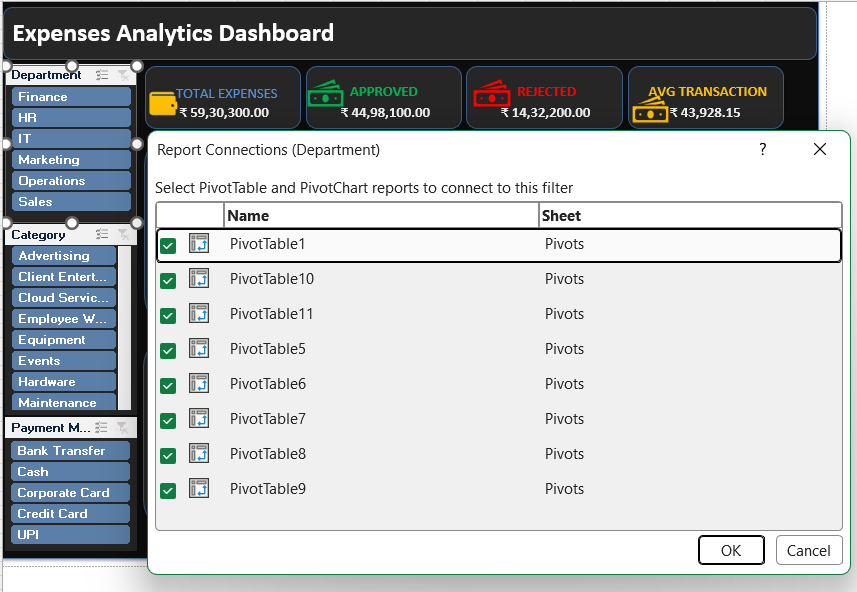
For example, your Department slicer should ideally connect to:
- Total Expenses
- Approved Expenses
- Rejected Expenses
- Average Transaction
- Monthly Trend
- Category Analysis
- Department Analysis
- Payment Method Analysis
Repeat the process for the other slicers.
Why Report Connections Matter
Once everything is connected, clicking:
Finance
will instantly update:
✓ Total Expenses
✓ Approved Expenses
✓ Rejected Expenses
✓ Average Transaction
✓ Monthly Trend
✓ Category Chart
✓ Department Chart
✓ Payment Method Chart
That is what turns a collection of charts into a real interactive Excel dashboard.
Step 16: Hide PivotChart Buttons
PivotCharts often display field buttons such as:
Month ▼
Sum of Amount ▼
These buttons make a finished dashboard look less polished.
To remove them:
- Click your PivotChart.
- Go to PivotChart Analyze.
- Select:
Field Buttons → Hide All
Do this for every chart.
Step 17: Remove Gridlines
Gridlines can make a professional dashboard feel like an unfinished worksheet.
Go to:
View
Then uncheck:
- Gridlines
- Headings
Your dashboard will immediately look cleaner.
Step 18: Format Everything Consistently
Before considering the dashboard finished, review the following.
Dashboard checklist
Layout
- All charts are properly aligned
- Cards have equal spacing
- Slicers are aligned
- Nothing overlaps
Design
- Consistent fonts
- Consistent borders
- Consistent background colors
- Consistent corner radius
Charts
- Remove unnecessary gridlines
- Hide PivotChart buttons
- Keep legends readable
- Avoid excessive colors
- Use data labels only where they add value
Functionality
- All slicers are connected
- KPIs update correctly
- Charts update correctly
- Pivot Tables refresh properly
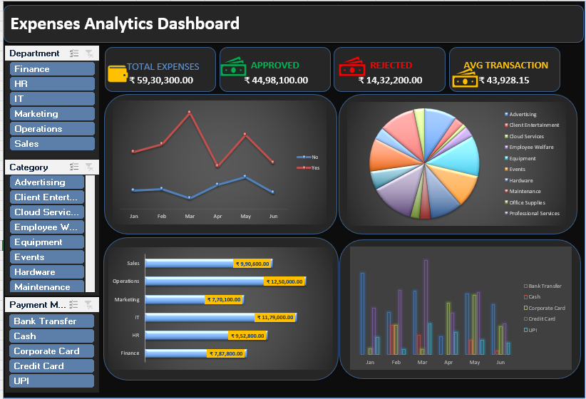
The Best Workbook Structure for This Dashboard
I recommend organizing your Excel file like this:
📁 Filtered Data
Contains the original expense transactions.
📊 Pivots
Contains all backend Pivot Tables.
📈 Dashboard
Contains the final interactive report.
This separation makes troubleshooting much easier.
If something goes wrong with a chart, you know exactly where to check: the Pivot sheet.
If a value looks incorrect, check the source data.
If the calculations are correct but the design looks wrong, check the Dashboard sheet.
Final Thoughts
Building an Excel dashboard is not just about creating attractive charts.
The real process is about building a reliable connection between your data and your visuals:
Clean Data → Structured Table → Pivot Tables → Interactive Filters → Useful Insights
Once you understand this workflow, you can use the same method to build many other dashboards, including:
- Sales Dashboards
- HR Dashboards
- Financial Dashboards
- Marketing Dashboards
- Inventory Dashboards
- Project Management Dashboards
The design may change, but the underlying process remains almost the same.
Frequently Asked Questions
Can I build this dashboard without VBA?
Yes. This dashboard can be created using standard Excel features such as Pivot Tables, Pivot Charts, Shapes, formulas, and slicers.
Will the dashboard update when I add new data?
Yes, provided your source data is stored in an Excel Table. After adding new records, refresh the Pivot Tables using:
Data → Refresh All
Can one slicer control multiple charts?
Yes. Use Report Connections to connect a slicer to multiple Pivot Tables that share the same data source.
Why are my KPI cards not updating?
Usually, this happens because the KPI cell is not linked correctly to the Pivot Table, or the slicer is not connected to the Pivot Table behind that KPI.
What is the most important part of building this dashboard?
The most important part is the data structure and Pivot Table connections. A beautiful design cannot fix incorrect data or disconnected slicers.


