
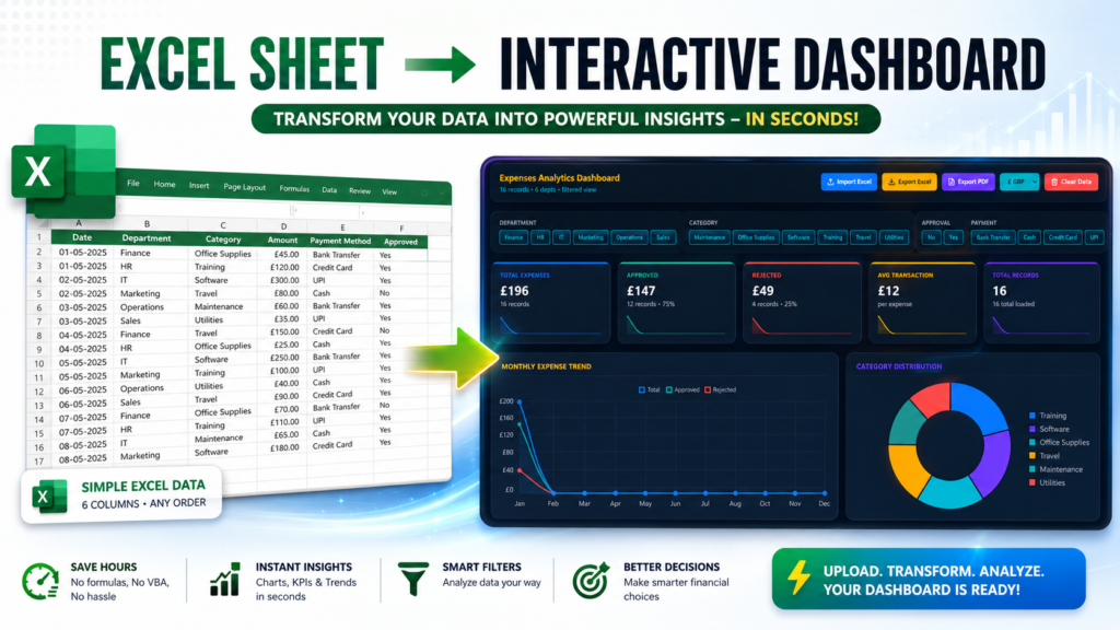

Imagine taking a simple Excel spreadsheet and turning it into a professional, interactive Expense Analytics Dashboard within seconds.
Sounds unbelievable?
Not anymore.
Businesses, freelancers, finance teams, and even students are looking for faster ways to visualize their expense data without spending hours creating Pivot Tables, charts, slicers, and formulas manually.
In this guide, I’ll show you how an ordinary Excel file can instantly become a beautiful dashboard that provides meaningful insights into your expenses. Whether you’re tracking company spending or managing your personal finances, this method can save hours of work.
Why Expense Analytics Matters More Than Ever
Every business generates data.
Unfortunately, most people store that data inside Excel files but rarely use it to make better decisions.
Instead of looking at thousands of rows, imagine seeing:
- Total expenses
- Department-wise spending
- Category analysis
- Payment method distribution
- Approval status
- Monthly expense trends
- Interactive charts
- KPI cards
- Filters that work instantly
This is exactly what an Expense Analytics Dashboard helps you achieve.
Rather than reading raw numbers, you start understanding your financial story.
The Excel Data You Need
One of the biggest misconceptions is that dashboards require complicated datasets.
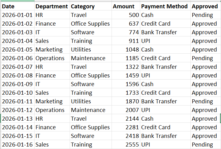
Actually, this dashboard needs only six columns.

| Column | Description |
|---|---|
| Date | Expense date |
| Department | Department responsible |
| Category | Expense category |
| Amount | Expense amount |
| Payment Method | Cash, Card, UPI, Bank Transfer, etc. |
| Approved | Yes or No |
That’s it.
The order of these columns doesn’t even matter because the system automatically identifies them during import.
This makes the dashboard beginner-friendly while remaining powerful enough for professionals.
Step 1: Prepare Your Excel File
Before importing your data, ensure that:
- Every column has a proper header.
- Dates use a consistent format.
- Amount values are numeric.
- Empty rows are removed.
- Duplicate entries are cleaned if necessary.
Even basic data preparation significantly improves dashboard accuracy.
A clean Excel sheet always produces better analytics.
Step 2: Upload Your Excel File
This is where the magic begins.
https://us.seoanalyser.in/dashboard/expense
Instead of manually building charts, formulas, Pivot Tables, and slicers, simply drag and drop your Excel file into the dashboard.
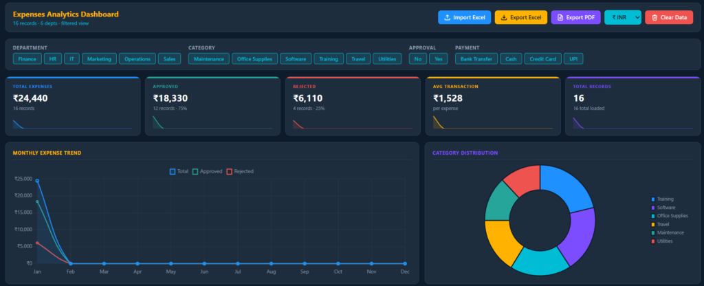
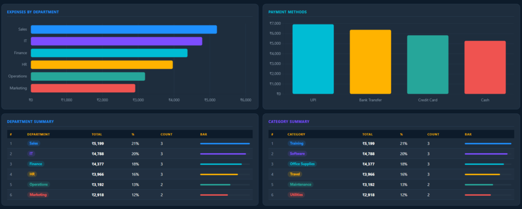
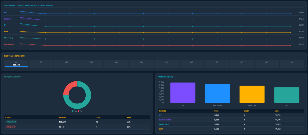
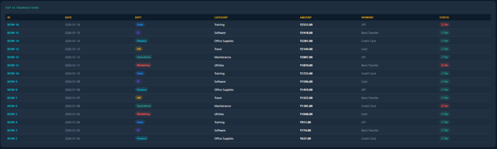
Within seconds, the dashboard reads your spreadsheet and generates:
- Interactive charts
- Summary cards
- Expense breakdowns
- Category reports
- Department analysis
- Payment insights
- Approval statistics
No VBA.
No formulas.
No complicated setup.
Just upload and analyze.
What Makes This Dashboard Different?
Traditional Excel dashboards usually require:
- Pivot Tables
- Pivot Charts
- Power Query
- VBA coding
- Advanced Excel formulas
- Manual formatting
This dashboard removes all that complexity.
Instead, it automatically performs the heavy lifting for you.
Even users with basic Excel knowledge can generate professional-looking reports.
Interactive Dashboard Features
Once your data is uploaded, the dashboard becomes fully interactive.
Some of the key features include:
KPI Cards
Instantly view:
- Total Expenses
- Approved Expenses
- Pending Expenses
- Number of Transactions
These metrics update automatically whenever filters are applied.
Department-wise Analysis
Want to know which department spends the most?
The dashboard displays a visual comparison so that high-spending departments can be identified immediately.
Finance managers no longer need to manually calculate totals.
Category Breakdown
Expenses are automatically grouped into categories such as:
- Travel
- Office Supplies
- Food
- Software
- Utilities
- Marketing
This helps identify spending patterns quickly.
Payment Method Insights
See how expenses are paid across the organization.
For example:
- UPI
- Credit Card
- Cash
- Bank Transfer
These insights help finance teams understand payment trends.
Approval Tracking
Every organization wants visibility into approved and pending expenses.
The dashboard automatically separates them, allowing managers to monitor approval status without searching through spreadsheets.
Beautiful Charts
Instead of boring tables, your data transforms into interactive visualizations.
These may include:
- Bar charts
- Pie charts
- Line charts
- Trend analysis
- Distribution charts
Visual data is always easier to understand than raw numbers.
Why Businesses Love Automated Dashboards
Companies deal with hundreds—or even thousands—of expense records every month.
Creating reports manually takes valuable time.
An automated dashboard helps by:
- Reducing manual work
- Eliminating reporting errors
- Improving decision-making
- Saving hours every week
- Presenting data professionally
- Helping management identify trends
That’s why more businesses are shifting toward automated reporting tools.
Who Can Use This Dashboard?
This dashboard isn’t limited to finance professionals.
It is useful for:
- Small business owners
- Startups
- Accountants
- Finance managers
- Students
- Freelancers
- HR teams
- Project managers
- Consultants
- Operations teams
Anyone who works with Excel expense data can benefit from it.
Why Visualization Is Better Than Spreadsheets
Imagine receiving a spreadsheet with 10,000 rows.
Finding useful information would take considerable time.
Now imagine opening a dashboard where everything is already summarized.
Within seconds, you know:
- Which department spends the most.
- Which category has the highest cost.
- Which payment method is most common.
- How many expenses are pending approval.
- Overall spending trends.
That is the power of data visualization.
Save Time Without Learning Advanced Excel
Many professionals postpone dashboard creation because they think they need to master:
- Power Query
- Power Pivot
- VBA
- DAX
- Advanced formulas
The reality is different.
Modern dashboard tools automate these processes, allowing users to focus on analysis instead of setup.
Common Mistakes to Avoid
To get the best results, avoid these common issues:
- Missing column headers
- Blank rows
- Mixed date formats
- Text values inside the Amount column
- Duplicate transactions
- Incorrect payment method names
Maintaining clean data ensures accurate analytics.
Real-World Applications
Expense dashboards are widely used across industries.
Some practical use cases include:
Business Expense Tracking
Monitor organizational spending across departments.
Personal Finance Management
Track monthly expenses and identify unnecessary spending.
Startup Budget Monitoring
Understand where limited budgets are being utilized.
Project Cost Tracking
Analyze project-specific expenses in real time.
Educational Institutions
Track departmental expenditure and approvals.
Why Automation Is the Future
Manual reporting consumes valuable business hours.
Automation enables organizations to:
- Generate reports instantly.
- Reduce human errors.
- Improve reporting consistency.
- Make faster financial decisions.
- Share professional dashboards with stakeholders.
The future of Excel reporting is no longer manual—it’s automated.
Final Thoughts
Turning a simple Excel spreadsheet into a fully interactive Expense Analytics Dashboard no longer requires advanced Excel skills, programming, or hours of manual work.
With only six basic columns—Date, Department, Category, Amount, Payment Method, and Approval Status—you can transform raw data into meaningful insights in just seconds.
Whether you’re a business owner tracking operational costs, a finance professional preparing monthly reports, or someone managing personal expenses, automated dashboards make data easier to understand and act upon.
The real value isn’t just creating beautiful charts—it’s making faster, smarter financial decisions with confidence.
As businesses continue embracing automation, interactive dashboards are becoming an essential part of modern financial reporting rather than a luxury.
If you’ve never experienced automated Excel analytics before, now is the perfect time to explore how quickly your spreadsheet can become a powerful decision-making tool.
Frequently Asked Questions (FAQs)
How many columns are required to create the dashboard?
Only six columns are needed: Date, Department, Category, Amount, Payment Method, and Approved Status.
Do I need advanced Excel skills?
No. The dashboard is designed for users of all experience levels and automates the visualization process.
Can I upload existing Excel files?
Yes. As long as your data contains the required columns, you can upload your existing spreadsheet.
Is this suitable for business expense tracking?
Absolutely. It works well for businesses, startups, freelancers, and anyone who wants to analyze expense data efficiently.
Does the dashboard generate charts automatically?
Yes. Once the Excel file is uploaded, charts, KPIs, summaries, and expense analytics are generated automatically.
If you found this guide helpful, share it with someone who works with Excel regularly. You might save them hours of manual reporting every month.


