
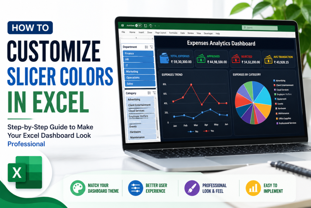

How to Customize Slicer Colors in Excel:– A well-designed Excel dashboard is not just about charts and numbers. The small details also matter.
One of the easiest ways to make your dashboard look more professional is by customizing your slicer colors.
By changing the colors of selected items, unselected items, headers, borders, and hover effects, you can make your slicers match the overall design of your dashboard.
This guide explains everything clearly, step by step.
How to Create a Custom Slicer Style in Excel
First, select your slicer.
Then go to:
Slicer → Slicer Styles → New Slicer Style
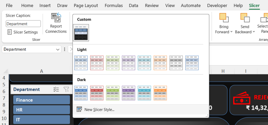
A window called New Slicer Style will open.
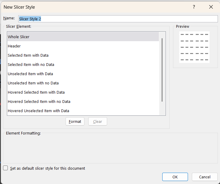
Here, you can customize different parts of your slicer.
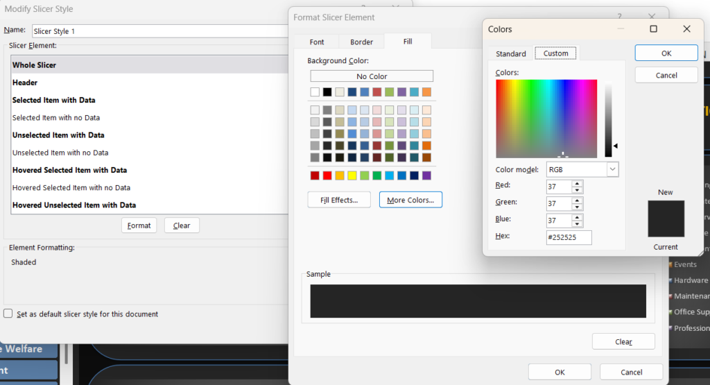
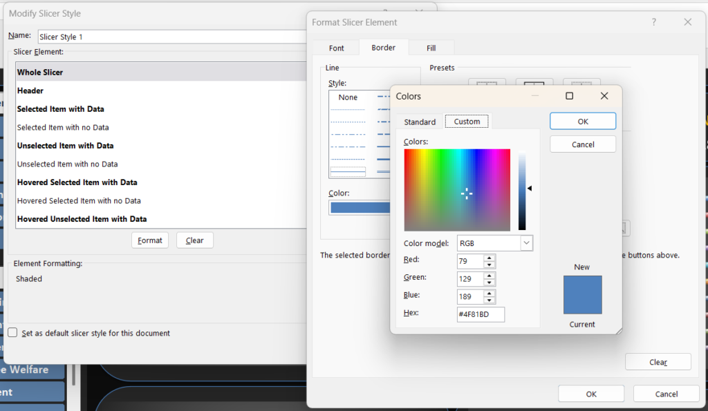
1. Whole Slicer
The Whole Slicer option controls the overall appearance of the slicer.
You can change:
- Background color
- Border color
- Border thickness
Recommended Setting
Background Color: #252525
Border Color: #4F81BD
This works well for a modern dark-themed Excel dashboard.
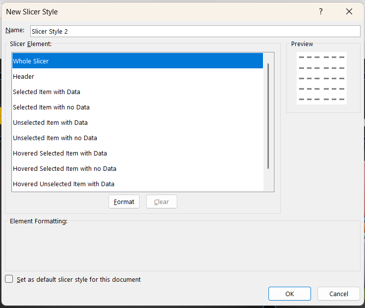
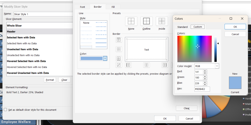
2. Header
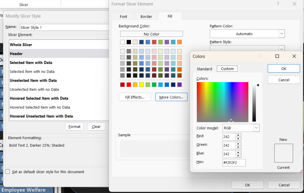
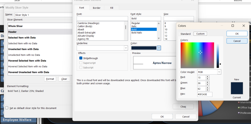
The Header is the top section of your slicer.
For example:
- Department
- Category
- Region
- Product
Recommended Setting
Background: #F2F2F2
Font Color: Dark Gray or Black
Font Style: Bold
Border: Light Blue or Gray
This creates a clean and professional appearance.
3. Selected Item with Data
This is the most important setting.
It controls the appearance of the slicer button when a user selects an option.
For example, when you click Finance, HR, or Marketing, this setting controls the selected button color.
Go to:
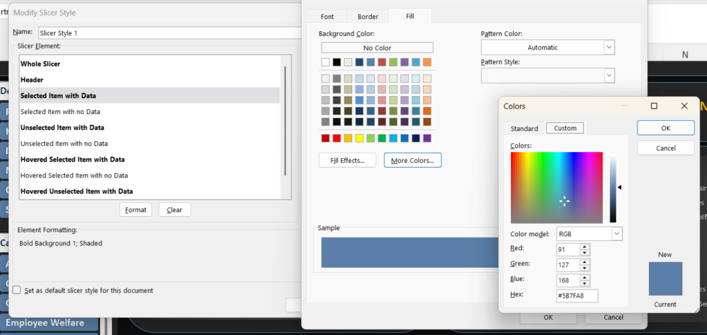
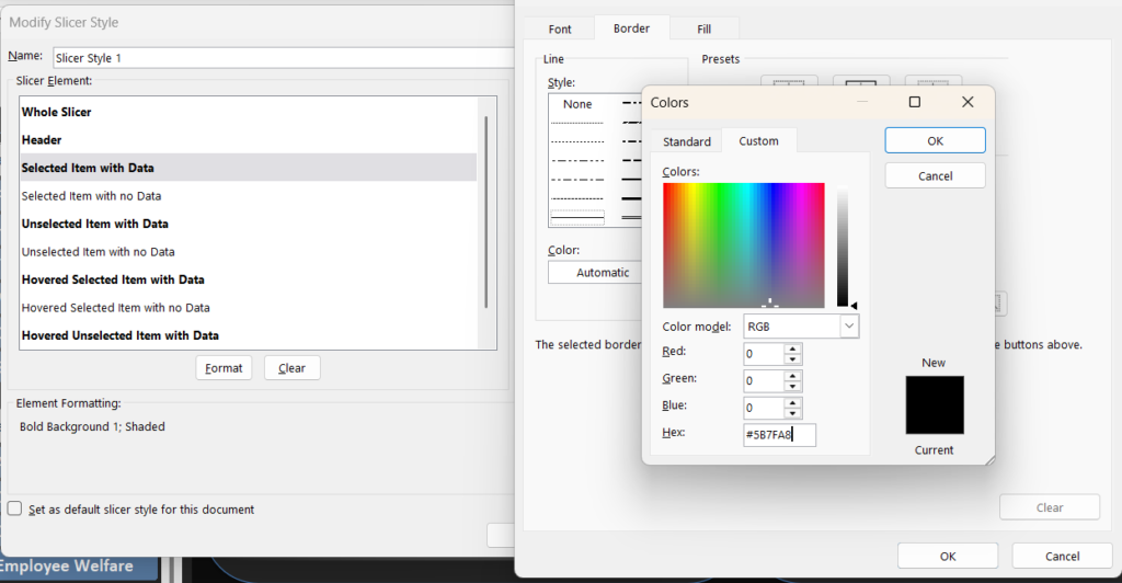
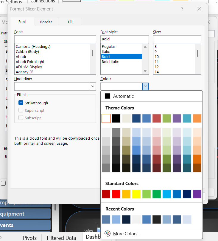
Selected Item with Data → Format
Recommended Setting
Fill Color: #5B7FA8
Font Color: White
Border Color: #5B7FA8
This creates a professional blue selected button.
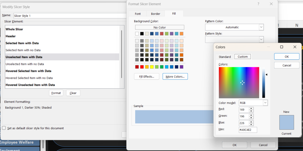
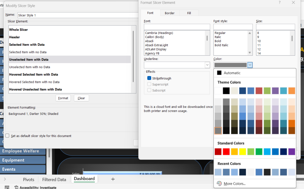
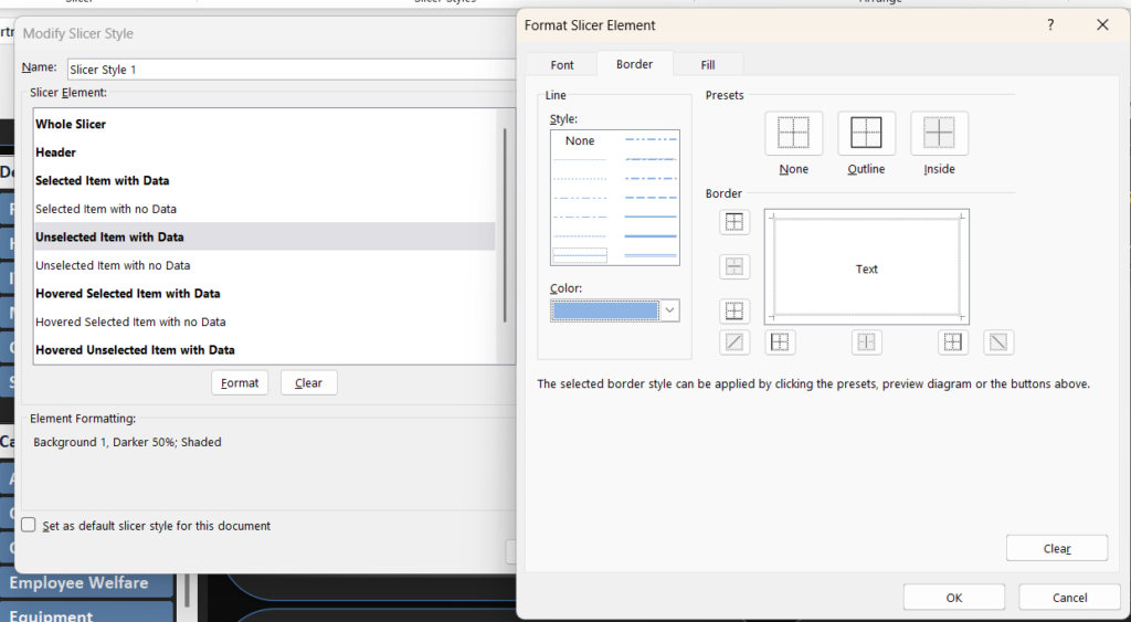
4. Unselected Item with Data
This controls the appearance of buttons that are not selected.
Go to:
Unselected Item with Data → Format
Recommended Setting
Fill Color: #A9C4E2
Font Color: Dark Gray
Border: Light Blue
This creates a clear difference between selected and unselected options.
5. Hovered Selected Item
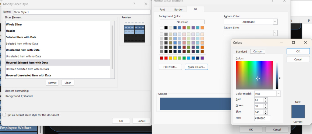
This controls the color when you move your mouse over a selected slicer button.
Recommended Setting
Fill Color: #3F628C
Font Color: White
Using a slightly darker blue creates a better interactive effect.
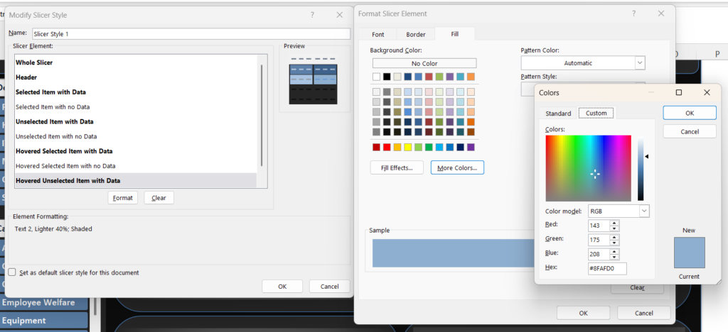
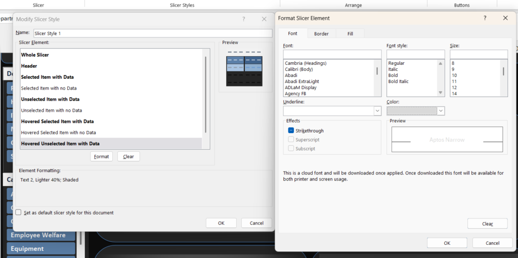
6. Hovered Unselected Item
This controls the color when you move your mouse over an unselected button.
Recommended Setting
Fill Color: #8FAFD0
Font Color: White or Dark Gray
Recommended Slicer Color Palette
| Slicer Element | Recommended Color |
|---|---|
| Selected Item | #5B7FA8 |
| Hovered Selected Item | #3F628C |
| Unselected Item | #A9C4E2 |
| Hovered Unselected Item | #8FAFD0 |
| Whole Slicer | #252525 |
| Header | #F2F2F2 |
| Border | #4F81BD |
Tips for Creating Professional Excel Slicers
Keep Your Colors Consistent
Use the same color palette across your:
- Slicers
- KPI Cards
- Charts
- Titles
- Dashboard Borders
This makes your dashboard look more professional.
Make Selected Items Easy to Identify
Selected buttons should always look different from unselected buttons.
For example:
Selected Item: Dark Blue
Unselected Item: Light Blue
This helps users understand the dashboard filters quickly.
Avoid Too Many Colors
Using too many colors can make your dashboard look confusing.
Try to use:
- One primary color
- One secondary color
- One accent color
Use Good Text Contrast
Make sure the text is easy to read.
For dark backgrounds, use light text.
For light backgrounds, use dark text.
Final Thoughts
Customizing slicer colors is a simple way to improve the appearance of your Excel dashboard.
The three most important settings to focus on are:
- Whole Slicer
- Selected Item with Data
- Unselected Item with Data
Once these are customized, you can improve the design further by changing the header, borders, and hover effects.
A few small changes can make your Excel dashboard look cleaner, more modern, and much more professional.


