
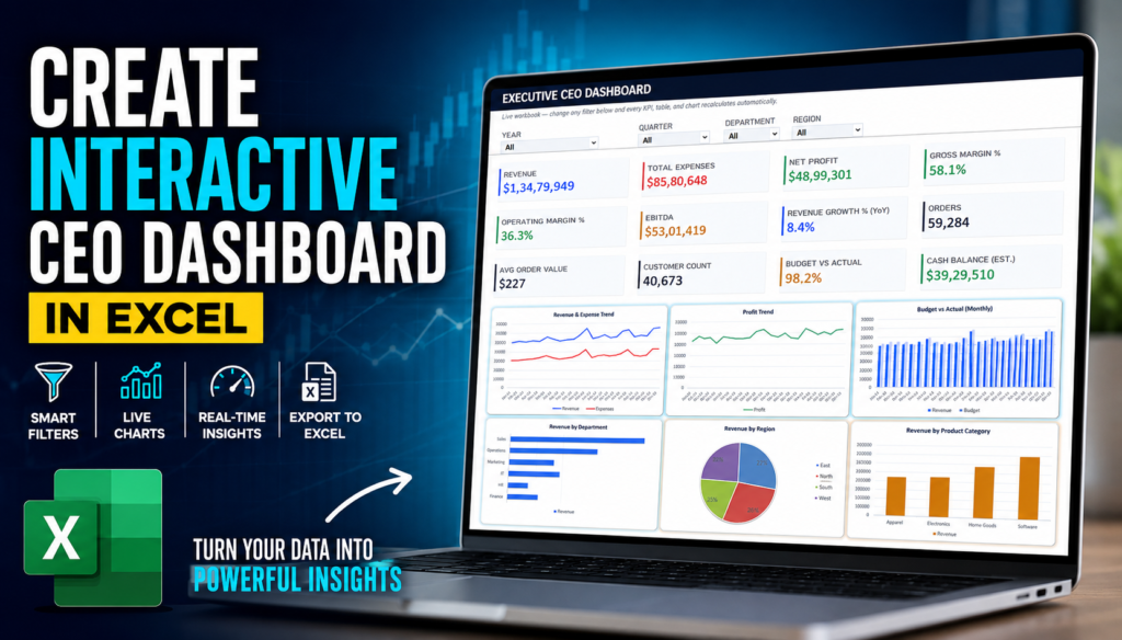

CEO Performance Dashboard:-Business leaders don’t need more spreadsheets—they need a clear view of what the numbers are actually saying.
A CEO or business decision-maker often needs answers to important questions quickly:
- Which department is performing best?
- Where is revenue growing?
- Which region needs attention?
- How does performance change from quarter to quarter?
- Are actual results meeting expectations?
- Which numbers should be investigated before making the next decision?
The challenge is that these answers are often buried inside large Excel files.
That’s why I created an interactive CEO Performance Dashboard that makes it easier to transform Excel data into a visual, filterable dashboard.
Try the Interactive CEO Dashboard
You can explore the dashboard here:
Open the Interactive CEO Dashboard
The dashboard is designed to give users a quick overview of business performance while still allowing them to explore the numbers in more detail.
What Is a CEO Performance Dashboard?
A CEO Performance Dashboard is a visual reporting interface designed to bring important business metrics into one place.
Instead of manually checking multiple worksheets and reports, users can view key information through:
- KPI cards
- Interactive filters
- Performance charts
- Department-level analysis
- Regional analysis
- Revenue and profit trends
- Budget versus actual comparisons
The goal is simple:
Turn raw Excel data into information that is easier to understand and act upon.
Start With Your Excel Data
Every dashboard starts with data.
In this example, the dashboard uses structured business data that can be analyzed across multiple dimensions.
The interactive dashboard includes filtering options for:
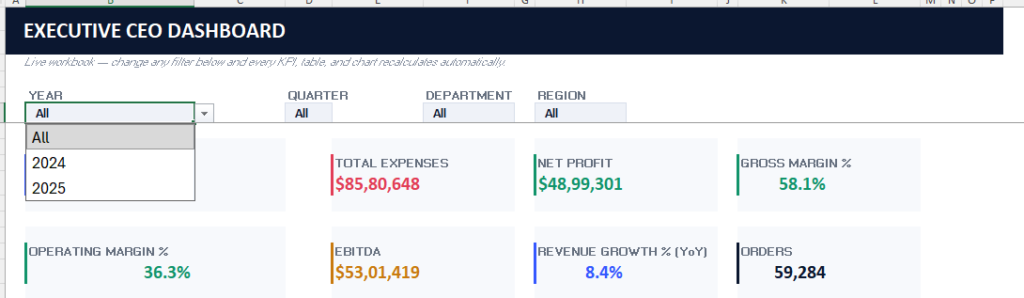
1. Year
Users can analyze performance across different years.
This makes it easier to compare historical business performance and identify changes over time.
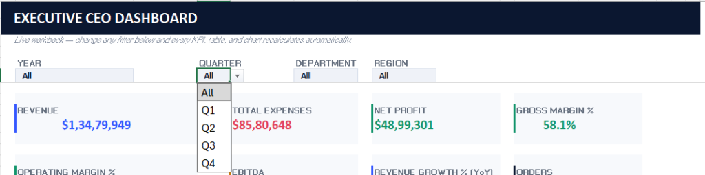
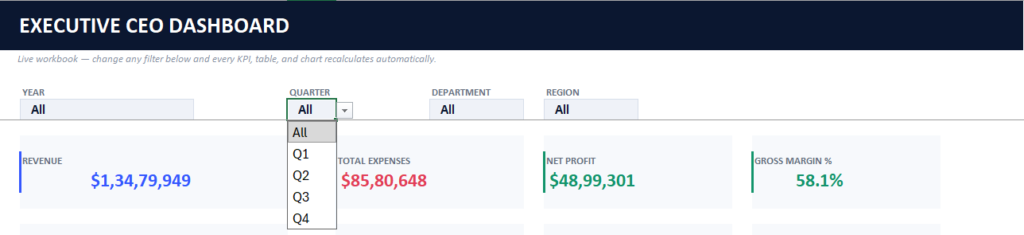
2. Quarter
Quarterly analysis helps users understand how business performance changes throughout the year.
For example, you can quickly compare Quarter 1 with other quarters and see how the numbers change.
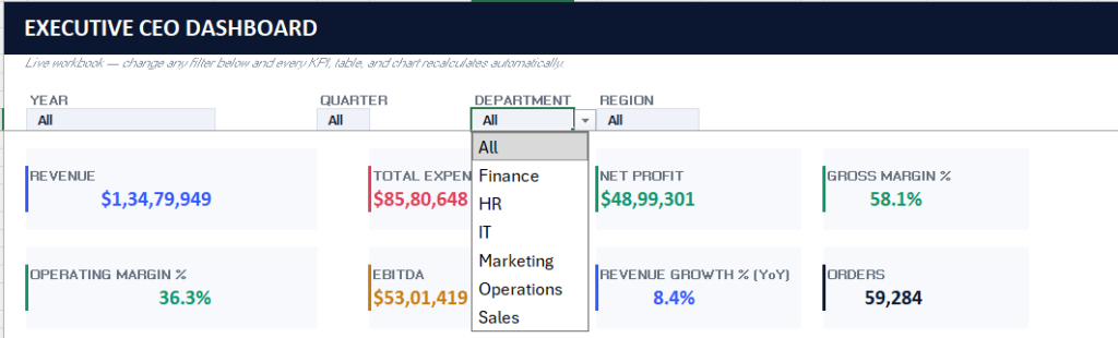
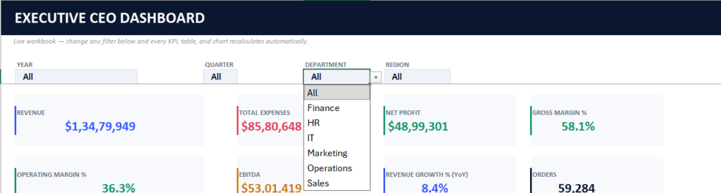
3. Department
Department-level filtering helps identify which teams or business units are contributing the most to overall performance.
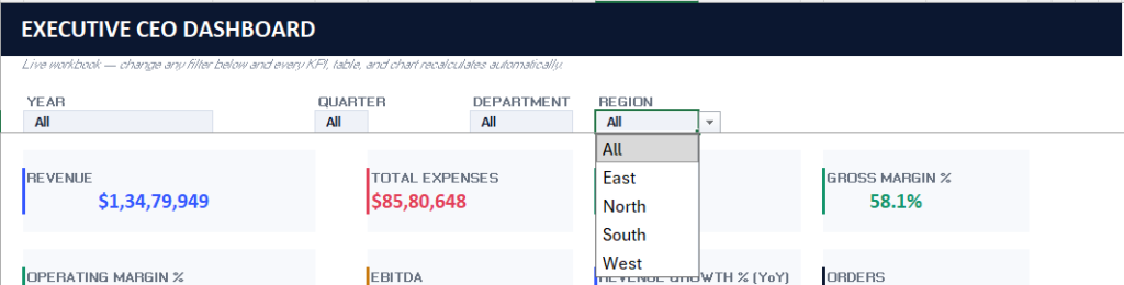
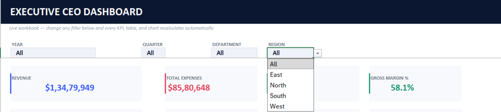
4. Region
Regional filtering makes it possible to analyze performance based on geographic areas.
This can help users understand whether business growth is consistent across different regions.
Upload Your Excel Data and Create a Dashboard
One of the most useful parts of this tool is the ability to work with Excel data directly.
The process is designed to be simple:
- Open the CEO Dashboard.
- Import your Excel workbook.
- Allow the dashboard to process the available data.
- Explore the dashboard visually.
- Apply filters to analyze the numbers.
- Export the dashboard data back to Excel when needed.
This approach can save time compared with manually building every chart and dashboard element from scratch.
You can explore the tool here:
The Dashboard Updates When You Change Filters
The most important feature of an interactive dashboard is that the data should respond to the user’s selection.
For example, you can select:
Year → Quarter → Department → Region
As the filters change, the dashboard can update the connected information so you can focus on the specific part of the business you want to analyze.
This makes the dashboard useful for asking practical questions such as:
- How did a specific department perform in a particular quarter?
- Which region generated the strongest revenue?
- How did business performance change during a selected period?
- Which department is performing below expectations?
Instead of creating a separate report for every possible combination, users can explore the available information interactively.
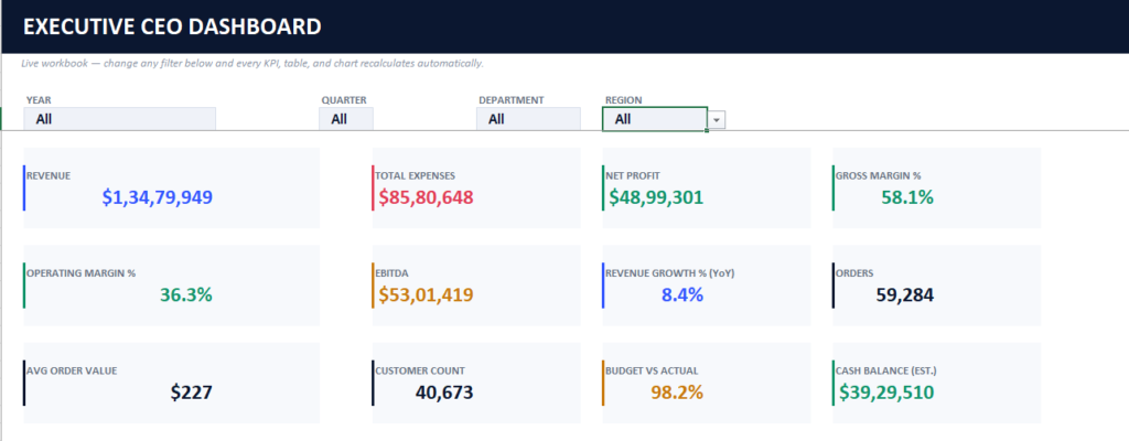
KPI Cards Give You a Quick Performance Overview
A good executive dashboard should make important numbers easy to find.
That’s where KPI cards become useful.
KPI cards can provide a quick summary of key business metrics before users move into deeper analysis.
The advantage is speed.
A CEO, manager, analyst, or business owner can first look at the headline numbers and then use filters and charts to investigate the details behind those numbers.
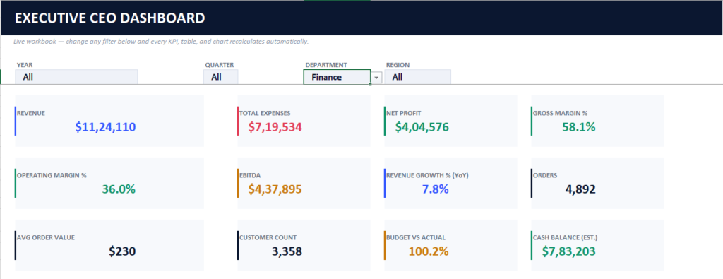
Explore Department Performance
Department analysis is one of the most important parts of a business dashboard.
The dashboard allows users to explore department-wise performance and identify stronger and weaker areas.
This can help answer questions like:
- Which department is contributing the most?
- Which department needs more attention?
- How does each department compare with the overall business?
- How does department performance change after applying a specific filter?
Seeing the information visually can make patterns easier to identify than reviewing large rows of spreadsheet data.
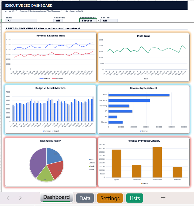
Analyze Performance Through Live Charts
Charts are often where raw data becomes easier to understand.
The CEO Dashboard includes multiple visualizations for analyzing business performance, including:
- Revenue and expense trends
- Profit trends
- Budget versus actual performance
- Revenue by department
- Revenue by region
- Revenue by product category
- Department performance
The dashboard also supports live filtering, allowing users to change the perspective of the analysis.
For example:
Analyze Quarter-by-Quarter Performance
Select a specific quarter and review how the charts change.
This can help identify seasonal patterns or performance differences between periods.
Analyze Regional Performance
Apply a region filter and review the available numbers and charts from that perspective.
The dashboard can then help users focus on the performance of the selected region.
Combine Multiple Filters
The real value comes from combining filters.
For example, you might want to analyze:
A specific year + a specific quarter + a department + a region
This makes it easier to move from a broad overview to a more focused analysis.
Export Your Dashboard Back to Excel
Excel is still one of the most widely used tools for business reporting.
That’s why exporting the results remains useful.
After exploring the dashboard, users can export information to an Excel sheet for additional reporting, sharing, or analysis.
This creates a practical workflow:
Excel Data → Interactive Dashboard → Filter & Analyze → Export to Excel
Go Beyond Data: Improve the Dashboard Design
Building a dashboard isn’t only about adding numbers and charts.
Presentation also matters.
A well-designed dashboard can make information easier to read and understand.
After creating the initial dashboard, you can further improve its appearance by working on:
- Chart placement
- Spacing between elements
- Card sizes
- Shapes
- Layout consistency
- Background styling
- Visual effects
Step 1: Optimize Placement and Spacing
The first improvement is to organize the dashboard layout.
Proper spacing helps prevent the dashboard from feeling crowded.
Users should be able to move naturally from:
Filters → KPIs → Department Analysis → Charts
without feeling overwhelmed.
Step 2: Improve Shapes and Visual Structure
Cards and dashboard elements should have a consistent visual appearance.
Improving the shapes and structure can make the dashboard look more professional while also improving readability.
Step 3: Add Background Colors and Visual Effects
Background styling can help create a stronger visual identity.
You can choose colors based on your requirements and use subtle effects to make the dashboard more visually engaging.
The key is balance.
A dashboard should look attractive—but the design should never make the data harder to read.
Why Interactive Excel Dashboards Are Useful
Interactive dashboards can help reduce the time required to manually explore spreadsheet data.
Instead of repeatedly creating new reports, users can change filters and view the available information from different perspectives.
This can be particularly useful for:
- CEOs and executives
- Business owners
- Financial analysts
- Sales managers
- Operations teams
- Department heads
- Data analysts
The biggest benefit is that the dashboard provides both:
A High-Level Overview
For quickly understanding overall business performance.
A Detailed Analysis Experience
For exploring departments, quarters, regions, and other available dimensions.
A Simple Example of How to Use the Dashboard
Imagine you want to understand business performance for a particular period.
You could follow this process:
Step 1: Select the Year
Choose the year you want to analyze.

Step 2: Select the Quarter
Focus on a particular quarter.
Step 3: Select the Department
Analyze a specific department.
Step 4: Select the Region
Narrow the analysis to a particular region.
Step 5: Review KPI Cards
Check the headline numbers.
Step 6: Explore Department Performance
Identify stronger and weaker performance areas.
Step 7: Review the Charts
Analyze trends and patterns.
This workflow makes it easier to move from a general business overview to a focused analysis.
The Goal: Make Business Data Easier to Understand
The purpose of a dashboard should not be to add more charts.
The purpose should be to help people understand the data.
A useful dashboard should help answer questions faster, identify important patterns, and make business information easier to explore.
That’s the idea behind this interactive CEO Performance Dashboard.
You can start with Excel data, explore the information through filters and charts, customize the visual presentation, and export the results when needed.
Explore the Interactive CEO Dashboard
Launch the CEO Performance Dashboard
Try the filters, explore the charts, and see how different selections change the available business insights.
Watch the Full Dashboard Tutorial
In the accompanying tutorial, I demonstrate the complete workflow:
- Starting with Excel data
- Uploading the data
- Creating the dashboard
- Applying Year, Quarter, Department, and Region filters
- Exploring KPI cards
- Analyzing departments
- Reviewing live charts
- Exporting to Excel
- Optimizing chart placement and spacing
- Improving shapes and design
- Adding background styling
The complete process shows how raw spreadsheet data can be transformed into a more interactive and visual reporting experience.
Final Thoughts
Business data becomes more valuable when it is easier to understand.
An interactive dashboard can help turn rows and columns into a clearer picture of business performance.
With filters, KPI cards, live charts, department analysis, regional analysis, and Excel export capabilities, users can explore the data from different perspectives without manually rebuilding reports every time.
If you’re working with business data in Excel and want a faster way to explore your numbers visually, you can try the interactive CEO Dashboard below.


