
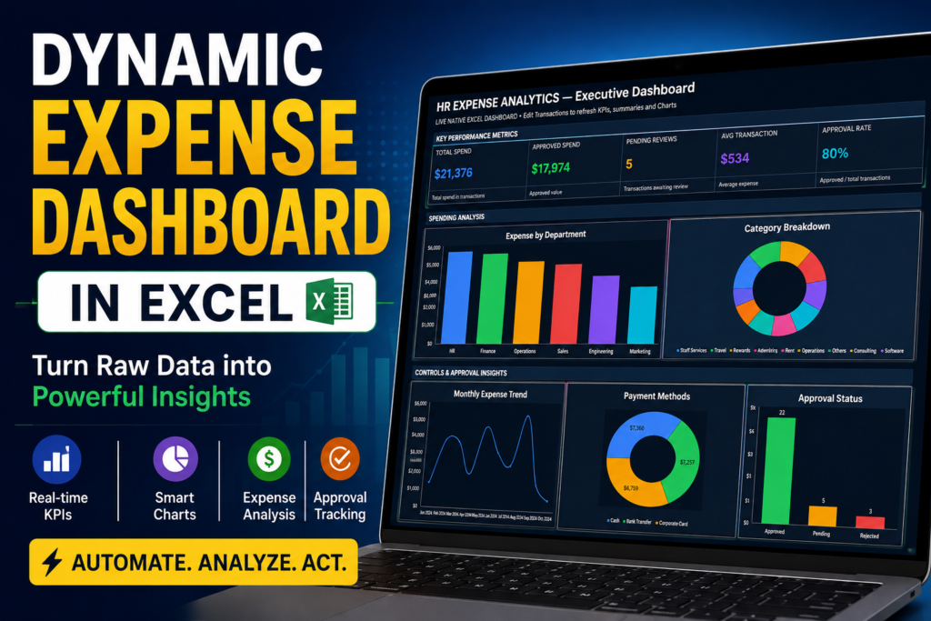

Dynamic Expense Dashboard in Excel: Turn Raw Data Into a Professional Report
Learn how to turn raw expense data into a dynamic Excel dashboard with KPIs, department analysis, category breakdowns, monthly trends, payment methods, approval status, currency selection, and Excel export.
Turn Raw Expense Data Into a Professional Dashboard
A spreadsheet full of expense transactions can contain valuable information, but finding that information manually can take time.
You may have hundreds or thousands of rows containing departments, categories, dates, payment methods, approval status, and expense amounts.
The data is there.
The challenge is turning those numbers into something that is easy to understand and useful for decision-making.
That is where a dynamic expense dashboard in Excel can make a significant difference.
Instead of repeatedly preparing summary tables, calculating KPIs, and creating charts manually, a well-structured dashboard can bring the most important information together in one place.
In this example, we start with raw expense data and transform it into a professional dashboard containing KPIs, charts, expense analysis, trends, and reporting insights.
And the interesting part?
The same dashboard can also be exported back into Excel for further analysis.
What Does an Expense Dashboard Do?
An expense dashboard is a visual reporting system that summarizes expense data and presents the most important information through KPIs, charts, trends, and breakdowns.
Instead of asking someone to review a large spreadsheet row by row, the dashboard provides a quick overview of the financial information.
For example, a manager may want to know:
- How much has been spent?
- How much spending has been approved?
- How much is still pending?
- Which department has the highest expenses?
- Which categories are consuming the most budget?
- How are expenses changing month over month?
- Which payment methods are being used?
- What is the current approval status?
A good dashboard brings these questions closer to the surface.
It doesn’t replace financial analysis or business judgment. Instead, it makes the underlying information easier to see and analyze.
From Raw Excel Data to a Dynamic Dashboard
Step 1: Start With Your Raw Expense Data
The process begins with the raw dataset.
In our example, the data contains the information required to analyze business expenses.
Depending on the organization, an expense dataset could include fields such as:
- Expense Date
- Department
- Expense Category
- Amount
- Currency
- Payment Method
- Approval Status
At first, this information may simply look like rows and columns.
But when the data is structured correctly, it becomes the foundation for a much more useful reporting system.
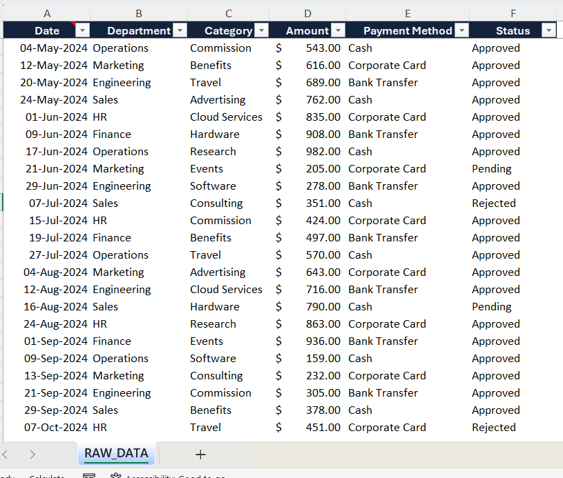
The important idea is simple:
Don’t start by designing charts. Start with the data.
Once the underlying data is organized, the dashboard can transform it into meaningful visual information.
Create the Dashboard With a Simple Workflow
Once the raw data is ready, it can be loaded into the dashboard workflow.
Go to Link: –https://us.seoanalyser.in/dashboard/HR-Expense/
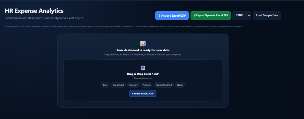
Instead of manually creating every calculation and visualization, the dashboard processes the data and generates the reporting structure.
The result is a much faster transition from:
Raw Data → KPIs → Analysis → Charts → Business Dashboard
This is particularly useful for recurring reports.
Imagine receiving a new expense dataset every month.
Without a reusable dashboard, you may repeat the same reporting process again and again.
With a dynamic approach, the goal is to make the reporting workflow more reusable and reduce unnecessary manual work.
That is one of the biggest advantages of dashboard automation.
Change the Dashboard Currency
Another useful feature is the ability to change the reporting currency.
Businesses often work with different currencies depending on their location, customers, suppliers, subsidiaries, or reporting requirements.
For example, a dashboard may need to display:
- US Dollars ($)
- Indian Rupees (₹)
- Euros (€)
- British Pounds (£)
- UAE Dirhams (AED)
In our example, we can select US Dollars and update the dashboard accordingly.
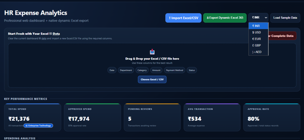
This makes the dashboard more flexible when the same reporting workflow needs to support different users or regions.
Track Important Expense KPIs
One of the first things users see on a dashboard should be the information that matters most.
That’s why KPI cards are such an important part of an expense dashboard.
The example dashboard includes metrics such as:
Total Spend
This provides an overall view of the expense amount represented by the dataset.
Approved Spend
This helps users understand how much spending has already moved through the approval process.
Pending Spend
Pending expenses can highlight items that may still require review or approval.
Additional Expense Metrics
Depending on the data structure, additional KPIs can be included to provide a broader view of the organization’s expenses.
The advantage of displaying these numbers at the top is simple:
You don’t need to search through the spreadsheet to find the headline figures.
The important information is immediately visible.

Analyze Expenses by Department
Knowing the total expense is useful.
But knowing where that money is being spent is even more useful.
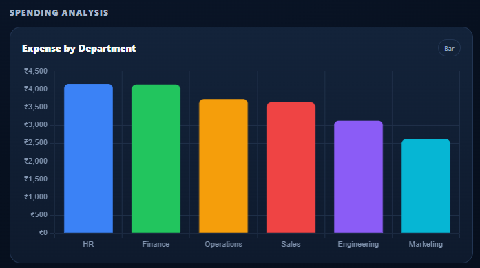
The Expense by Department visualization provides a quick comparison of spending across departments.
For example, a business might compare:
- Finance
- Sales
- Marketing
- Operations
- Human Resources
- IT
The exact departments depend on the organization’s data.
This type of visualization can help management identify areas with relatively high spending and determine where additional investigation may be useful.
A dashboard doesn’t automatically tell you whether high spending is good or bad.
For example, a sales department may naturally have higher expenses because of travel and customer activities.
The dashboard’s role is to make the pattern visible.
The decision comes from the business context.
Understand the Category Breakdown
The next important question is:
What are we actually spending money on?
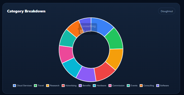
This is where the Category Breakdown becomes useful.
Expenses can be grouped into categories such as:
- Travel
- Software
- Office Supplies
- Equipment
- Marketing
- Training
- Employee Expenses
- Professional Services
The category breakdown helps reveal how the total expense is distributed.
For example, if software expenses represent a significant portion of total spending, the business may want to review the software subscriptions and usage.
If travel expenses suddenly increase, the organization can investigate the reason behind the increase.
The dashboard doesn’t make the decision for the business.
Instead, it makes the information easier to interpret.
See Monthly Expense Trends
A single expense number tells you what happened.
A trend can tell you much more.
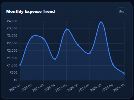
The Monthly Expense Trend chart allows users to see how spending changes over time.
This can help identify:
- Increasing expenses
- Decreasing expenses
- Seasonal patterns
- Unusual spikes
- Significant monthly changes
For example, if expenses remain relatively stable for several months and then suddenly increase, that change deserves attention.
Was there a major project?
Was there an unusual purchase?
Did travel increase?
Did a new subscription or service begin?
The chart provides the starting point for those questions.
Analyze Payment Methods
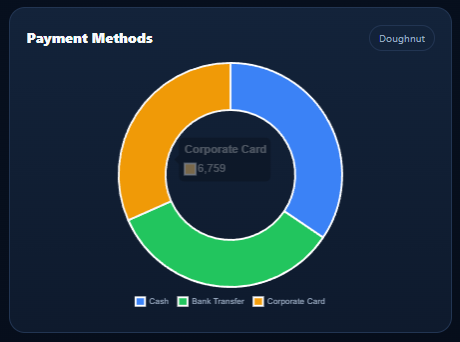
Another useful view is the Payment Methods analysis.
Businesses may use multiple methods to pay expenses, including corporate cards, bank transfers, cash, or other digital payment methods.
Displaying this information visually can help finance teams understand how expenses are being processed.
It can also make reconciliation and reporting easier when the underlying data is properly maintained.
Again, the value isn’t simply in creating another chart.
The value comes from making an otherwise difficult-to-read dataset easier to understand.
Monitor Approval Status
Expense management often involves an approval process.
That’s why Approval Status is another useful dashboard component.
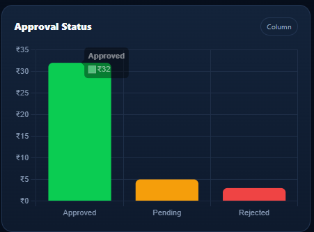
Expenses can be categorized according to their current status, such as:
- Approved
- Pending
- Rejected
A visual summary makes it easier to identify how many expenses are sitting in each stage.
For example, a large number of pending expenses may indicate that additional review is required.
For finance and management teams, this can provide a useful operational snapshot.
Export the Dashboard to Excel
One of the most useful aspects of this workflow is the ability to continue working with the dashboard in Excel.
After creating the dashboard, the report can be exported into an Excel workbook.
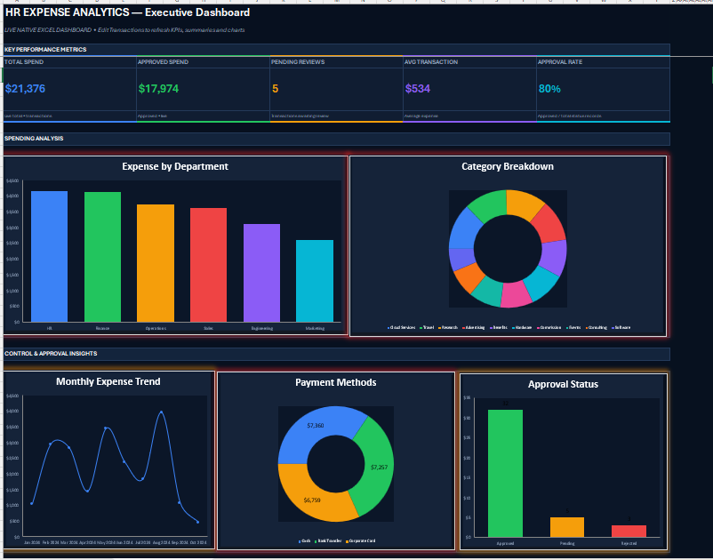
When the exported workbook is opened, you can see the KPI information and charts inside Excel.
This is important because many businesses still depend heavily on Excel for reporting, collaboration, analysis, and data management.
The goal isn’t simply to create a beautiful dashboard.
The goal is to create something that can fit into an existing business workflow.
Why a Dynamic Excel Dashboard Is More Useful Than a Static Report
A static report can look great.
But a dynamic report can be much more useful.
A static screenshot gives you a picture of the information at one point in time.
A dynamic workbook can allow users to continue working with the underlying data, formulas, calculations, and reporting structure.
That means the dashboard can potentially become a reusable reporting solution rather than a one-time presentation.
This is particularly valuable for recurring monthly or weekly reporting.
Instead of rebuilding the entire report from scratch, you can establish a repeatable workflow around the same dashboard structure.
Make Excel Charts Look More Professional
Creating the dashboard is only part of the process.
Presentation matters too.
A dashboard can contain accurate calculations and still look difficult to use if it is crowded or poorly organized.
In our example, we can improve the visual presentation by making several simple changes.
Remove unnecessary gridlines
Removing unnecessary gridlines can create a cleaner dashboard canvas and make the charts easier to focus on.
Resize the charts
Charts should have enough space to display their labels and values clearly.
Align the visual elements
Consistent alignment helps the dashboard feel organized.
Improve the shapes and layout
KPI cards, chart containers, headings, and other elements should have a consistent visual structure.
The objective isn’t to add more decoration.
It is to remove distractions.
Less clutter.
More clarity.
Better reporting.
Download Dashboard
Simple formatting improvements can make an Excel dashboard cleaner and easier to read.
From Spreadsheet to Business Reporting Tool
This is where the concept becomes more interesting.
Excel is often treated as a place to store numbers.
But with the right structure, Excel can also become a powerful reporting environment.
The transformation looks like this:
Raw Data
↓
Automated Calculations
↓
KPI Summary
↓
Visual Analysis
↓
Business Dashboard
↓
Editable Excel Report
The goal is not simply to make Excel look attractive.
The goal is to make the information easier to use.
A well-designed dashboard can help teams spend less time searching for information and more time interpreting it.
Who Can Use an Expense Dashboard?
A dynamic expense dashboard can be useful for a wide range of users.
Finance Teams
Finance teams can use expense dashboards to summarize spending and monitor approval information.
HR Teams
HR departments can use expense reporting for employee-related expenses, reimbursements, and departmental analysis.
Operations Teams
Operations teams can monitor spending across departments, projects, or cost centers.
Business Managers
Managers can use dashboards during monthly or quarterly reviews to quickly understand important expense trends.
Small Businesses
Small businesses can use Excel dashboards to establish a structured reporting process without necessarily introducing a complex reporting platform.
Excel Professionals
Excel consultants and professionals can use dashboard structures as the foundation for customized reporting solutions.
Why Dashboard Automation Can Save Time
Think about a traditional reporting process.
You receive the raw data.
Then you clean it.
Calculate totals.
Create summary tables.
Build charts.
Format the workbook.
Check the numbers.
Prepare the final report.
And then…
next month…
you repeat the entire process.
This repetitive work can consume valuable time.
The purpose of automation is to reduce that repetition.
Instead of repeatedly rebuilding the same report, you can create a reusable workflow.
That means the reporting process can become more consistent and easier to maintain.
The real benefit isn’t just speed.
It’s consistency.
It’s repeatability.
And it’s the ability to spend more time understanding the numbers rather than formatting them.
The Bigger Idea: Turn Data Into Decisions
A dashboard should ultimately answer a simple question:
What can I understand from this data that I couldn’t see easily before?
Raw data gives you transactions.
A dashboard organizes those transactions.
KPIs summarize them.
Charts reveal patterns.
Trends show changes over time.
And the combination gives decision-makers a clearer picture of what is happening.
That is why dashboards remain valuable across finance, sales, HR, operations, inventory, project management, and many other business functions.
The underlying principle is always similar:
Turn complex data into useful information.
Want to Try the Dynamic Dashboard?
If you want to try this dynamic expense dashboard yourself, comment “DYNAMIC” on the video.
We can share the dashboard and the procedure.
And if there is a specific Excel dashboard, tracker, automation, or business tool you would like to see next, leave your idea in the comments.
Your suggestion could become the next tool we build.
You can also explore more practical dashboard solutions through our Dashboard Collection and discover other Excel-based reporting tools designed to turn raw business data into useful visual reports.
Final Thoughts
A spreadsheet doesn’t have to remain a spreadsheet.
With the right structure, raw expense data can become a dynamic reporting system that provides KPIs, department analysis, category insights, monthly trends, payment information, approval tracking, and a professional visual summary.
The workflow is simple:
Start with your data.
Build the calculations.
Create the visualizations.
Analyze the results.
Improve the design.
Export and reuse the report.
The result is a dashboard that is not only easier to read…
but potentially much more useful for everyday business reporting.
And that’s the real purpose of a dynamic Excel dashboard.
Don’t just store your data.
Understand it.
Visualize it.
And use it to make better decisions.
Frequently Asked Questions
What is a dynamic expense dashboard in Excel?
A dynamic expense dashboard is an Excel-based reporting system that summarizes expense data using KPIs, charts, calculations, and visual analysis. It can be designed so that changes in the underlying data are reflected in the reporting output.
What KPIs should an expense dashboard include?
Common KPIs include Total Spend, Approved Spend, Pending Spend, rejected expenses, transaction counts, and other metrics relevant to the organization’s reporting requirements.
Can an Excel expense dashboard show different currencies?
Yes. A dashboard can be designed with a currency-selection feature so that the displayed reporting currency can be changed according to the reporting requirement.
What charts are useful for expense analysis?
Useful visualizations can include Expense by Department, Category Breakdown, Monthly Expense Trends, Payment Methods, and Approval Status.
Can the dashboard be exported to Excel?
Yes. In this workflow, the dashboard can be exported into an Excel workbook so users can continue working with the report and underlying calculations.
Is an expense dashboard useful for small businesses?
Yes. Small businesses can use an Excel-based expense dashboard to organize spending information, monitor important KPIs, and create recurring reports without building a complex reporting system from scratch.
Can the dashboard be reused every month?
A properly structured dynamic dashboard can be designed as a reusable reporting workflow. Instead of rebuilding the report manually each month, users can update or replace the underlying data and continue using the dashboard structure.
Try the Dashboard
Want this Dynamic Expense Dashboard?
Comment DYNAMIC on the video to get the dashboard and procedure.
And if you want to explore more Excel dashboards and business reporting tools, visit our Dashboard Collection.


