
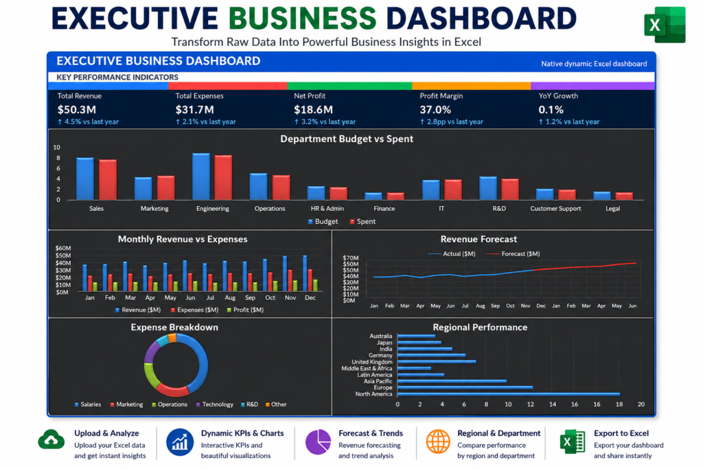

Executive Business Dashboard in Excel | Professional KPI Dashboard
Discover how an Executive Business Dashboard in Excel transforms raw business data into KPIs, YoY growth, forecasts, regional analysis, department performance, and expense insights.
What Is an Executive Business Dashboard?
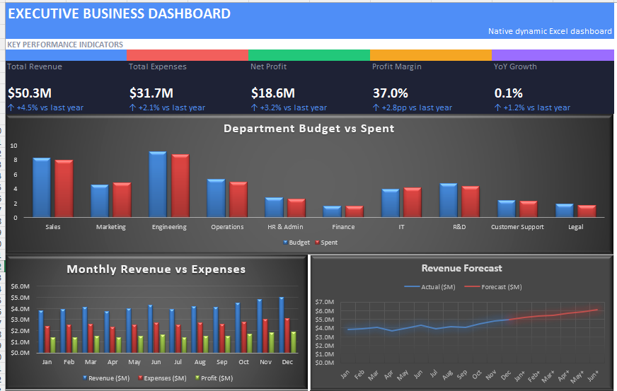
Business data is everywhere.
Companies collect information about revenue, expenses, departments, regions, budgets, and growth every day. But having data is not the same as understanding it.
That is where an Executive Business Dashboard in Excel can make a major difference.
Instead of spending hours going through rows and columns, an executive dashboard brings the most important business metrics into one professional view.
The Executive Business Dashboard is designed around this idea: take business data and turn it into easy-to-understand KPIs, charts, trends, forecasts, and performance analysis.
The dashboard provides a simple workflow: upload your Excel or CSV data, allow the dashboard to process the information, and start exploring the results. It supports Excel, XLS, and CSV files and can automatically detect flexible column names for supported data structures.
Why Businesses Need an Executive Dashboard
Imagine receiving a large Excel file containing thousands of business records.
You could manually create:
- KPI calculations
- Monthly reports
- Regional summaries
- Department reports
- Growth calculations
- Expense charts
- Forecast reports
- Management presentations
But repeating this process every month can take a significant amount of time.
A dashboard changes the workflow.
Instead of asking, “Where is the data?”, management can quickly ask:
“What is happening in the business?”
An effective executive dashboard helps decision-makers identify trends, compare performance, understand expenses, and focus on the areas that require attention.
This is also why automated Excel dashboards are becoming increasingly useful for business reporting.
If you want to see another example of how automation can dramatically reduce dashboard-building time, check out our guide on building a complete Excel dashboard in 60 seconds using VBA.
What Is Included in This Executive Business Dashboard?
The dashboard is organized into several important business analysis sections.
1. Key Performance Indicators
The first thing an executive normally wants to see is the overall business performance.
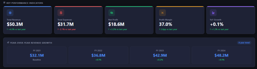
The dashboard provides important KPI metrics such as:
- Total Revenue
- Total Expenses
- Net Profit
- Profit Margin
- YoY Growth
For example, the sample dashboard displays total revenue, total expenses, net profit, profit margin, and year-over-year growth directly at the top.
This gives management an immediate snapshot of business health without searching through multiple worksheets.
2. Year-over-Year Growth Analysis
Growth is one of the most important indicators of business performance.
The YoY Growth section allows users to compare revenue performance across multiple fiscal years.
Instead of looking at individual reports, executives can quickly see whether revenue is increasing, slowing down, or accelerating.
For example, the sample dashboard presents a four-year revenue trend, making it easier to understand the direction of the business.
This type of analysis is particularly useful for management meetings, monthly reviews, quarterly business reviews, and strategic planning.
3. Monthly Revenue and Expense Analysis
Annual numbers are useful, but they don’t always explain what is happening inside the business.
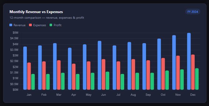
Monthly analysis provides another level of detail.
The dashboard compares:
- Revenue
- Expenses
- Profit
across the year.
This makes it easier to identify strong months, expense spikes, seasonal patterns, and periods where profitability changes.
A monthly trend chart can also help management answer an important question:
Are expenses increasing faster than revenue?
If revenue is growing but expenses are growing even faster, the business may need to investigate its cost structure.
4. Revenue Forecasting
One of the most useful sections of an executive dashboard is the Revenue Forecast.
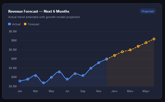
The dashboard extends the historical revenue trend into a future projection, helping users visualize potential performance for upcoming months.
Forecasting should not replace proper financial planning, but it can provide a useful visual starting point for business discussions.
Executives can use this information to think about:
- Future revenue expectations
- Growth targets
- Resource requirements
- Budget planning
- Business expansion
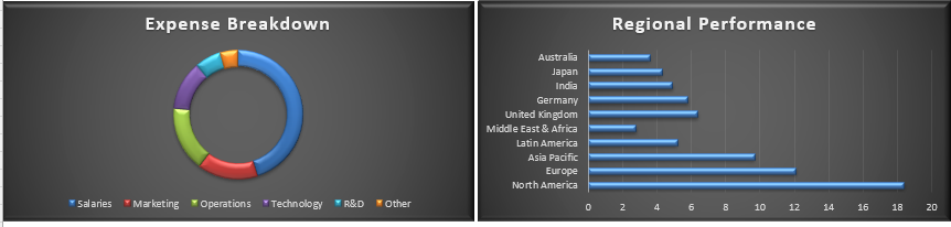
5. Regional Performance
Different regions rarely perform exactly the same way.
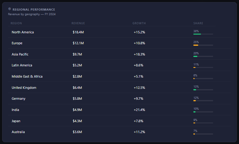
The Regional Performance section helps management understand revenue by geography.
The dashboard can display information such as:
- Region
- Revenue
- Growth
- Market Share
This allows decision-makers to identify high-performing regions and areas that may require additional attention.
For organizations operating across multiple territories, this can be especially useful.
Instead of manually comparing separate regional reports, executives can review the information in one centralized dashboard.
6. Department Performance
Revenue is only one part of business performance.
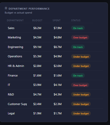
Departments also need to be monitored.
The Department Performance section focuses on budget versus actual spending.
This makes it easier to understand which departments are operating within budget and which departments may require further investigation.
For management teams, this can turn a complicated budget report into a much simpler visual review.
7. Expense Breakdown
Expenses can have a major impact on profitability.
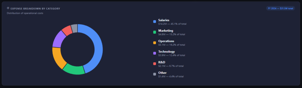
The dashboard includes an Expense Breakdown by Category, allowing users to understand how operational costs are distributed.
This can help answer questions such as:
- Which expense category is the largest?
- Where are costs increasing?
- Which expenses should be reviewed?
- How much of the total budget is being consumed?
When revenue and expenses are viewed together, management gets a much clearer picture of actual business performance.
From Raw Excel Data to Business Insights
The biggest advantage of a dashboard is not simply its appearance.
It is the transformation from raw data to actionable information.
A traditional Excel file might contain thousands of rows.
A dashboard turns those rows into:
Data → KPIs → Charts → Trends → Insights → Decisions
That is the real value of business dashboard design.
If you are interested in learning more about different Excel dashboard concepts and tools, you can also explore our Excel dashboard collection for additional tutorials and projects.
How to Use the Executive Business Dashboard
Using the dashboard is straightforward.
Step 1: Prepare Your Data
Start with structured business data containing information such as revenue, expenses, regions, departments, budgets, and growth metrics.
Step 2: Upload the File
Open the Executive Business Dashboard and drop your Excel or CSV file into the upload area.
The dashboard supports .xlsx, .xls, and .csv files.
https://us.seoanalyser.in/dashboard/Executive-Business-Dashboard
Step 3: Review the KPIs
Once your data is loaded, review the key performance indicators.
Start with revenue, expenses, profit, margin, and growth.
Step 4: Explore the Analysis
Move through the different sections to understand monthly trends, forecasts, regional performance, department spending, and expense distribution.
Step 5: Export Your Results
Once the analysis is complete, you can export the dashboard for further use in Excel or reporting workflows.
Executive Dashboard vs. Traditional Excel Reports
A traditional report often requires users to search for information.
An executive dashboard presents the information visually.
| Traditional Excel Report | Executive Dashboard |
|---|---|
| Large rows of data | Visual summary |
| Manual analysis | Faster interpretation |
| Multiple reports | Centralized view |
| Difficult trend identification | Clear trends |
| Time-consuming reporting | Faster decision-making |
The goal isn’t to replace Excel.
The goal is to make Excel more useful for decision-making.
More Excel Dashboard Projects
If you enjoy practical Excel dashboards, there are several other projects worth exploring.
For example, our Interactive Excel Sales Dashboard demonstrates how raw sales data can be transformed into KPI cards, PivotTables, charts, and interactive filters.
You can also explore Project INSPECT: School Infrastructure Monitoring System to see how the same dashboard concept can be applied to a completely different real-world use case.
These projects demonstrate an important idea:
A dashboard is not limited to sales or finance.
The same principles can be applied to operations, HR, inventory, education, project management, expenses, and many other business processes.
Final Thoughts
An Executive Business Dashboard in Excel can turn complicated business data into a clear management view.
Instead of manually reviewing multiple reports, users can bring revenue, expenses, profit, growth, forecasts, regional performance, department budgets, and expense categories together in one place.
The biggest benefit is not just that the dashboard looks professional.
It is that the dashboard helps users see the story behind the numbers.
If you want to try the dashboard yourself, open the Executive Business Dashboard and upload your own Excel data.
And if you are building your own collection of Excel dashboards, don’t forget to explore our other Excel dashboard tutorials for more practical projects.
Raw data can tell you what happened.
A good dashboard helps you understand why it happened.
Frequently Asked Questions (FAQ)
1. What is an Executive Business Dashboard in Excel?
An Executive Business Dashboard in Excel is a visual reporting tool that converts raw business data into easy-to-understand KPIs, charts, trends, forecasts, and performance insights. It helps executives and managers quickly understand revenue, expenses, profit, growth, regional performance, and department performance.
2. Can I use my own Excel data with this dashboard?
Yes. You can upload your own Excel or CSV data to the Executive Business Dashboard. The dashboard is designed to process structured business data and present the information through visual reports.
3. What KPIs are included in the Executive Business Dashboard?
The dashboard includes important business KPIs such as Total Revenue, Total Expenses, Net Profit, Profit Margin, and YoY Growth. These metrics provide a quick overview of overall business performance.
4. Does the dashboard include revenue forecasting?
Yes. The dashboard includes a Monthly Revenue Forecast section that helps visualize potential future revenue based on historical performance and trends.
5. Can I analyze regional performance?
Yes. The Regional Performance section allows users to compare revenue and growth across different regions, making it easier to identify high-performing and underperforming areas.
6. Can I analyze department performance?
Yes. The dashboard includes Department Performance analysis, including budget-versus-actual information, which can help management monitor departmental spending.
7. Does the dashboard show expense categories?
Yes. The Expense Breakdown section provides a visual view of expenses by category, helping users understand where business costs are being allocated.
8. Can I export the dashboard to Excel?
Yes. The dashboard provides an export option so you can take the analyzed dashboard data into Excel for further reporting, sharing, or documentation.
9. Is this dashboard useful for management reporting?
Yes. An executive dashboard is particularly useful for management meetings, business reviews, monthly reporting, financial analysis, and strategic decision-making because important information is presented in one centralized view.
10. Where can I access the Executive Business Dashboard?
You can access the Executive Business Dashboard here and try it with your own business data.
11. Are there other Excel dashboard projects available?
Yes. You can explore the Excel Dashboard Table of Contents to discover additional dashboard projects and Excel automation tutorials, including the Excel Sales Dashboard.
12. Can beginners use an Excel business dashboard?
Yes. A well-designed dashboard can make business analysis easier even for users who are not advanced Excel experts. Instead of manually creating every calculation and chart, users can focus on understanding the information presented by the dashboard.


Vital information